The difficulty of using nuanced input as a driving factor in interactive artifact development


Introduction

In this essay, I will argue that it is problematic to use nuances as a driving factor to develop and iterate an interactive artifact. The base of argumentation will be my personal experience with working with interactivity and fabrication of artifacts along with methods and approaches rooted in the course literature. By nuances as a driving factor it is meant that the nuanced input the user makes and why it is problematic to be used as a basis for design iteration.

With nuanced input of an artifact, it is described as a term on how to make an artifact with a multitude of varying inputs a user can make when interacting with it. Nuance from a physical and bodily expression is any way, shape, or form a user can possibly think of when interacting with an object given the interaction is within the sensory boundaries of the artifact. The object possesses various sensors that act as inputs in which the human input can be translated into a language that the artifact can understand. The medium for transportation and interpretation of human input interaction has been, during this course, a computer and a microcontroller. Sensors used to capture sound and motion were a basic microphone, web camera, and a proximity sensor. Three different fields within interactivity were probed and with each field, an artifact was made. A nuanced way of interacting with the artifact was one of the goals with the object.

The quality and intrinsic limitations of sensors

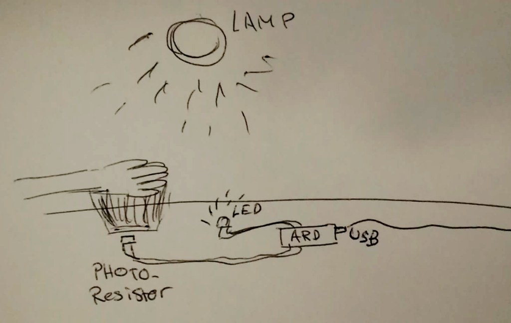
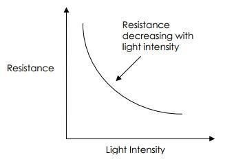
Fogtmann, Fritsch & Kortbek (2008) relates sensors as the sense organs of the computer. It is explained that there are a lot of different types of sensors that can capture human interaction. Common sensors such as camera, microphone, and proximity sensors are ubiquitous today, they can be found everywhere and most of them are already integrated into the host device. For my design work, I did use the built-in camera and microphone from the laptop. The proximity sensor for the microcontroller was a common budget model. It is worth pointing out that the quality of the sensors and the resolution they can record at, can’t be ignored. I would argue that the mere fact that there is a different quality to choose a sensor from is further complicating the design process when trying to apply a nuanced input from a design approach.

Nuance from our perspective can imply different things to people, depending on the environment, the setting, and the user. Movement pattern and our capacity to learn over time influenced by social and cultural context develops our understanding of when and how to put in a specific effort (Fogtmann et al, 2008). A painter might apply different techniques and a varying amount of nuanced brushstrokes in order to create the painting. Speed, pressure, and movement are nuances that are highly responsible for the outcome in this example. If there isn’t a direct coupling between the input interaction and the displayed result the artifact exhibits, the loop comes to an end. Resulting in a negative interaction experience with the artifact. 

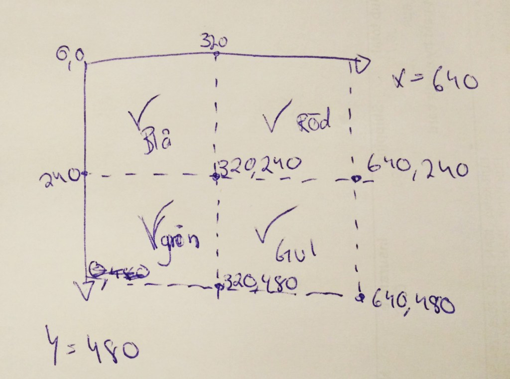
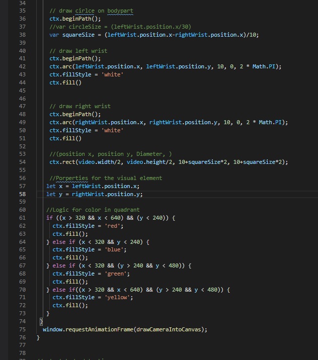
This was the issue with the artifact produced in module three during the course. A built in webcam from a laptop was used to track the motion of a user. Multiple tracking points were programmed into the software to follow. The user can approach this artifact with the view that there is a possibility to use the body in a nuanced way.

While the user is contained within a three dimensional space, the camera does not have to take that into account. The only technical input requirement it needs is a body to track and record that is within its specific framework. Using a high resolution camera which can record a higher rate of megapixels would be able to capture more accurate nuanced bodily movements but it would require more processing power from the computer and it’s not certain it would succeed in capturing with hundred percent accuracy. This points to the argument that the quality of the sensors can improve the accuracy of which the sensor can record at but only to a certain point, before it either hits an intrinsic limitation or the system needs too much processing power that it is not a viable approach to design with from the first start.

Nuance in the physical world contra digital artifacts

Djajadiningrat, Matthews & Stienstra (2007) mention skill and expression as a method to interact in a nuanced manner with physical objects around us to enrich the interactive user values. Usability as a user value is brought up as a problematic area that is in strict relation with how well a user can interact with an artifact, hence poor usability will in most cases result in a negative user interaction. 

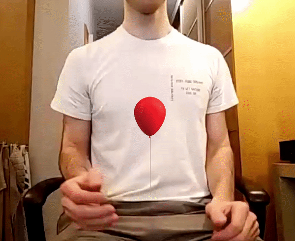
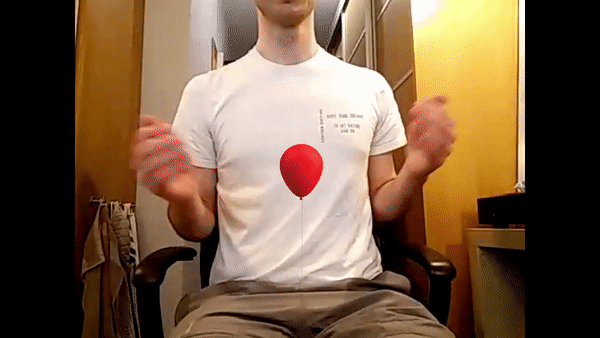
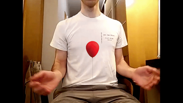
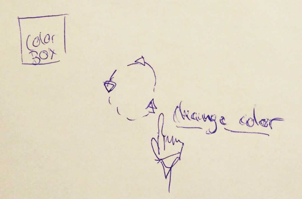
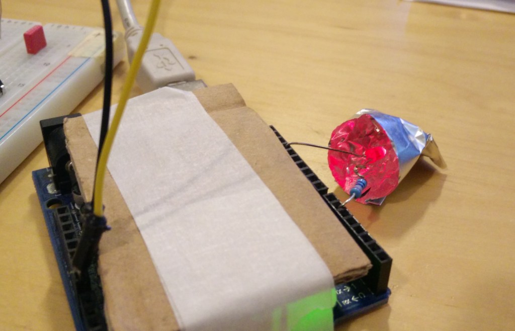
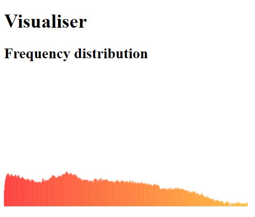
The result of the first interactivity module was an artifact where the user inputs a bodily skill to produce sound. The sound sample was then picked up by the microphone of the laptop and translated into a numerical value and used to control and display a specific color on the screen. The user could choose the right lightness, hue and color by producing a sound within a frequency, threshold, and peak. The way that the user can input this sound is highly nuanced. The motion, force, and material that produces the sound can be combined into many possibilities. The caveat of designing such a highly nuanced requirement for the input is that the digital world can’t interpret the skill as we do in the physical world. 

We are surrounded by boundaries and physical laws that dictate our possibilities to interact. These rules are very complex and not necessarily applicable in the digital world. Many rules don’t apply in the digital environment that the artifact is situated in and the argument lies in that there is an overlap between the physical and digital world in which context isn’t really clear. For instance it doesn’t matter the amount of speed, motion or force that was applied to the input. The microphone doesn’t take into account what we try to achieve with these attributes and neither the context or setting. It only listens for the raw value in which everything is included, it’s own vibrations produced by the computer it is built in and the ambient noise. Nuanced interaction is complex and requires a holistic view of the situation and material in order to work, this holistic view is something that shines with its absence in the digital world. Not because it isn’t implemented but rather that it is impossible to make work in that world.

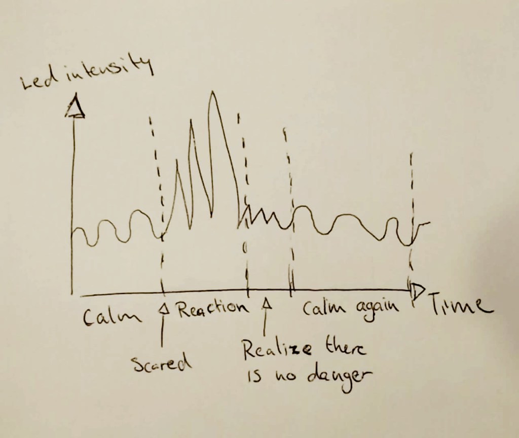
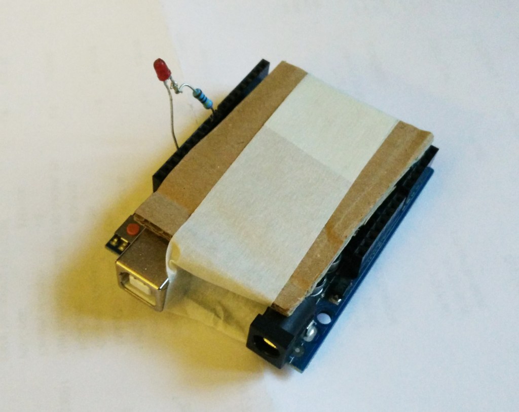
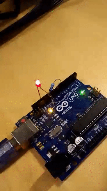
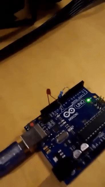
When we interact with each other we use our senses, experience, and understanding of the world to interpret something. Human emotion is something we tried to incorporate in module two. By giving an LED the ability to mimic a human emotion of being scared (by blinking rapidly) when it is approached too quickly or when a sudden sound is made. It is evident that no real human factors played any role when the led would blink. It simply is reacting when it’s told to by its own rules in its digital world set by the designer. What this argument highlights is the discrepancy between the real world where we have to account for different kinds of rules than just measuring distance and sound triggers.

Dreyfus (2002) mentions skill as something we continually develop and draw upon from our past and present experience of the real world. As a result, we are equipped with an understanding of what kind of response we can use in that context. Nuances on the input inherits therefore complex attributes as inclusiveness and sustainability which come naturally. By inclusiveness, it is meant that the action required at the input isn’t locked to a value represented by exact numbers. Variances in action should have the possibility to exhibit a consistent  and reliable outcome. Human interaction is far from perfectly replicable and asking the user to repeat the same action in a perfect accurate manner would not only exclude users that can’t perform the designed action but would also introduce a question whether or not the artifact is interpreting the input correctly. Given the error margin in the sensors and the way we interpret our movements as being perfect when in reality it is not. It is argued that “Current interfaces indeed seem to be built on the assumption that interaction can be captured in schemata and that the body is merely a mechanical executor”(Djajadiningrat et al., 2007, p.659). A counter argument would be that it makes sense from an artifact perspective to receive input in a strictly monotone and non-nuanced way. The result of the interaction would yield a perfect match in input to output interaction. 

Nuanced input and output coupling

During the time period of the interactivity course, I have developed and used nuanced input as a driving factor to enhance the interaction of the artifact. In the first module, there was a clear issue with trying to fabricate an interaction with nuance as the main quality for input. The continuous approach of using nuance as a way to further iterate the artifact was problematic. A human-computer interaction where the user could use a variety of nuanced movements to generate sound for the input, materialized in a counter-intuitive and asperous interaction. Notably, the lack of coupling between the input responsiveness and accuracy in the output interaction was pointed out as the main culprit. “Physical user actions and product reactions should not be seen as separate. The coupling between action and reaction is quintessential to interaction and considering the coupling of physical actions and reactions opens up a new space for design aesthetics and movement-based interaction” (Djajadiningrat et al., 2007, p.658). The weak relation between the input and output coupling not only limits and breaks the interactive relation they share but it will also limit possible design aesthetics and movement-based interaction which are key qualities when crafting a nuanced input.

Conclusion

The quality and physical limitation of a sensor should be considered as guidelines on how well a nuanced interaction can be exhibited at the artifact. I argue that there is a gap between human nuances and the resolution of which the sensor can record. This inevitably will present issues in the experience but it is also leading the development of the artifact into the wrong path. Nuance as the key quality for input is a troublesome approach which results from engagement in artifact design has exhibited. An alternative approach of using nuance as a driver for developing an interaction would be to assess the limitation and quality of the sensors and material before starting the artifact development. Once the variables and behaviour of the sensor is known, a limited and reasonably nuanced input interaction can be designed.

One of the key arguments in this essay is the argument that there is a evident discrepancy between how nuances are viewed in the physical world we live in and the digital world. The argument encapsulates the main issue with using nuanced input as a driving factor in artifact development. The reason being evident after hands-on experience with designing artifacts and the reason is that the digital world can’t interpret nuanced skill as we do in the physical world. Physical laws command our possibility to interact and perceive, whereas the digital artifact follows a different set of rules. Nuanced input becomes a trivial input in the digital artifact world as all the context, emotion and nuance from the real world is discarded for the mere recording of raw data. 

The expected relation between input and output from a digital artifact is often considered a usability question. The argument for coupling the nuanced input to an equally nuanced output is critical in succeeding with meaningful and sustainable interaction. The situation is bound to be unequal given the argument that nuanced input can’t be equally matched by nuanced output. Hence why my standpoint of using nuances as a factor to develop and iterate an interactive artifact is not recommended as an iterative approach. 

References

Djajadiningrat, T., Matthews, B., & Stienstra, M. (2007). Easy doesn’t do it: skill and expression in tangible aesthetics. Personal and Ubiquitous Computing, 11(8), 657-676.

Dreyfus, H. L. (2002). Intelligence without representation—Merleau-Ponty’s critique of mental representation. Phenomenology and the Cognitive Sciences, 1(4), 367–393.

Fogtmann, M. H., Fritsch, J., & Kortbek, K. J. (2008, December). Kinesthetic interaction: revealing the bodily potential in interaction design. In Proceedings of the 20th Australasian conference on computer-human interaction: designing for habitus and habitat (pp. 89-96).

M3 presentation

After some grueling weeks of battling with programing it is time to see what the class has learnt and what kind of insights is produced. My final sketch was supposed to be an interaction based on 3 interactions combined from post “Some progress…!?“. Unfortunately I had no way of combining them into one running interactive sketch as the code for each interaction was creating issues when combined with the other one.

Listening to the presentations and feedback during one session I could recognize that some of my colleagues had the same struggles as (my teammate and) I had. Constraints were a recurring topic some group struggled with that is also to my project. There is simply not enough experience felt through the kinaesthetic interaction. One of the dynamic attributes that plays a crucial role in an interaction is the coupling between input and output and therefore also an expectation of nuance. It being a major factor in whether the interaction has longevity or not. This is important to get right as we are supposed to design solution not only that makes sense and are useful but also sustainable solutions that can stand the test of time.

What is the kinaesthetic experience we are exploring? That came up a few times which I also think fits my project. I think that overall not enough time (due to various reasons) was an issue. The technical skills required to make the imagined design work was a bit steep and most of the time was a bit wasted on programing instead of experiencing the interaction which was the main goal. A couple of groups brought this up too, while it was easier for some to get technical help in person at school others (including myself) had to seek technical advice elsewhere.

This show and tell was a bit hard to summarize as each group got different and unique feedback and I think that this is mainly because this module was very dynamic. Doing the “same” style and execution was not going to happen as we could see in previous modules.

In conclusion, some final thoughts and reflections of this module:

  • As a team, we had a rough start, not having an agenda or deliverables was the culprit. Equal workload and effort was also an issue when I objectively assess how much we produced. Simply put we were to liberal with the time not knowing how much demanding it would be to program the interactions.
  • We started off with sport as theme and circular movements. By thinking about how physics work and the human body, circular movements made sense to pursuit. It may be a loosely defined theme that we didn’t really treated with the care it required. Not choosing to specify if further until the last week was also an issue which is tied to poorly executed collaboration and deliverables not being set.
  • Technical skills can sometimes lag behind, such as this case (and in this project) where more time is put into doing static/technical work rather than experiencing the material/interaction. This is a huge issue as this would crash the whole time plan and outcome if it were done in a professional context. Given that it is school work and the fact that we explore sometimes things we are not good at or need more training in, we can live with that. At least I know how much I’m capable of if a project with a programing theme would appear.
  • Although it didn’t shine through completely in my final sketches but kinaesthetic interaction makes sense to use only if the interaction is well crafted and responsive enough. A lot of issues coupling issues presented themselves during different iterations and explorations. I think that a majority of them wouldn’t exist if the sensor (webcam) or software were more detailed, precise and accurate.
  • This is not related to the content of the module but I felt that I have to mention something about the fact that working online with a subject that vastly is dependable on other people and peers input and comments is also an interesting insight. Given the whole situation with the pandemic, I didn’t do any user testing for this module which is limiting the possibility of a prototype that is well thought out and robust. User testing as a tool should in most cases be used to confirm or deny design solutions. Working the last week alone with this module was like working in the dark when it comes to iteration of the design.

Some progress…!?

I have been getting very technical with the sketches, the last 48 hours. A balloon model was created and connected with the wrists. From the perspective of facing the camera to the front, the only viable joints to use was the wrists. 3 different interactions were designed in order to explore the movement. Figure 1 is about slow movements to gently keep the balloon floating, a minor movement across the X-axis was added to it. As more drastic movement of the balloon didn’t match the input. However the coupling isn’t perfect but good enough to explore and get a sense of the movement.

Figure 1. Slow movements

A bit harder to program was the dynamic transition between slow to fast movement. A clear decoupling between the speed used to intentionally shoo away to the balloon felt not entirely natural. Either my hands are moving to fast for the webcam or the software is lagging behind, either way this sketch could be improved. A code snippet was added to the end so if speed is sustained at a certain level the balloon would eventually fly away. In my sketch I didn’t manage to make it fly away graciously it only disappears from the canvas. While in the gif it shows to be working but in reality the part where it disappears was could come whenever speed was created. So I’m guessing my code isn’t up to par.

Figure 2. Slow to fast movement

The last sketch was made to experience the air moving through the hands more freely and carefully. While the balloon didn’t disappear exactly when I stopped the movement I could still sense some connection to it. The way that air move around my hands felt natural and the coupling made sense. The difference from previous sketches is that the movement is more calm and controlled. Here again we can see a shortcoming of my programing skills, the balloon is supposed to fall down when I stop my movement…

Figure 3. Falling down

Experiencing all of these movement with the wrists as the joints being tracked, I came to the conclusion that the software actually tries its best to track points that aren’t really 100% visible all the time. I guess the backend, machine learning, comes into play and estimates where those points are. There is a paradox to these sketches and that is that the coding is done with a 2-D plane in mind. The X- and Y-axis has 4 quadrant that measure values constantly while my body is tracked in a 3-D space. Making sense of this conversion between real world, space and time to digital values is beyond my understanding but so far with the experimentations done we can identify problematic areas.

All in all there seems to be one way interaction in these sketches, mostly because the computer is looking for my movements and reacting accordingly. A nuanced dimension to the sketches could be shown where I, the user, wait for the computers move or response. Maybe we could have thrown the balloon to each other and avoid it falling down to the ground. A lot of ways of enhancing the nuance are visible but programing them is another feat I can’t accomplish on a short time or by myself.

Splitting up and developing the final sketch

Today was different in that sense that my teammate decided it was best if we split up and did the the project separately. Which I’m a bit surprised over because mostly, if not all of the time, I have been developing the material/code. I’m just a bit confused as to what the motivation behind the move is. These things certainly happen all the time in a professional setting too, the important part is that the knowledge gained during the time we worked together is shared.

Continuing on from where I last left off was that some kind of object has to interact with the user and so I came up with the idea of using a balloon as the object. Which technically wouldn’t be hard to program, just a colored circle with a straight cord.

Figure 1. Movement to control balloon

In order to create meaningful and coupled interaction, the movement that the user makes has make sense and offer a dynamic interaction. While I was trying out different movements I found that my pace was as if the balloon had some imaginary weight to it. The speed and force I used in figure 1 was more of trying to push air upwards to keep the balloon floating and moving. This made sense in a way, kind of like keeping a feather floating in the air. The point of keeping the balloon floating is to keep it in your possession, if the user stops to “generate” air the balloon would fall down to the ground.

Figure 2. Ballon drawn in canvas

In some way the interactive component is to keep generating air to keep the balloon floating, the force of the movement isn’t as important as the nuance of speed. Doing faster circular motions should generate more air and keep the balloon floating for a longer period of time or maybe it blows away from the frame? There is a couple of different scenarios I want to try out, as usual the only thing I fear is that programing will be a hinderance to try out those things.

Testing continuation…

Before I’m starting to address the actual work topic to the work I want to remind myself that things aren’t going as expected in this module. I was counting on producing roughly 5 posts a week but instead some posts contains progress and thoughts from the day before, as time is being taken up more by programing and less by experiencing. Writing how I feel about coding isn’t the main task rather reflection on the interactive experience of the module. Using and planning a weekly agenda is probably the way to solve this issue, which my teammate and I haven’t done. So this is a important note to my future self.

Some progress in experience were made, I tried out the precision and accuracy of the sketch. Amongst countless of trials and errors, these two videos were the ones with the best outcome.

Video 1
Video 2

As can be seen in both videos: one hand/wrist controls the color and the other one controls the size of the circle. This was an attempt to define the precision and accuracy of the material. Unfortunately the results are disappointing. Not much precision is achieved even though my movements are pretty calm and basic. Same test was attempted by placing the circle on different points and different joints were used to control the variables but the same result ensued.

With that in mind we can proceed in a different manner. As the object is continuously moving sometimes even randomly, can we incorporate it into the sketch so it acts as if it was natural? Maybe instead of circle we can have a balloon that floats upwards? The imprecise nature of the sketch might blend in with the random jittery movement of a balloon and should be less visible as balloons are normally bouncy and moving with the wind in real life.

As far as the input movement maybe we can go back and analyze which of the parts of the upper body (we are limiting ourselves to the upper body) we can use to control the object. What’s more interesting for me is also to use parts we usually don’t think about using when we want to control things. Elbows and shoulders come to mind.

Testing the accuracy of the sketches

Mostly I have been trying to wrap my head around the coding which is the biggest challenge for now. We got some direction with coaching but there seems to be a lack of collaborative progress on coding the sketches. For now I have taken the responsibility of programing while Kristian is exploring/investigating movements (with and without the sketches).

Making a sense of the details of the sketch is the hardest part. I feel that in order to start crafting the interaction I need to know how detailed the resolution of the camera is. At this point I don’t know what’s really happening at the backend of the sketch, if more computing power is needed or if something else is making the frames lag? I crafted some simple sketches to test out the accuracy. The point is to control the color/size of the circle with the wrists by moving in different directions on the axis.

Figure 1. The x-, y-coordinations of the canvas

As the window is 480×640 pixels that is the maximum of our canvas. Could be bigger but for now I feel that trying out the precision with upper body is enough.

figure 2. The correct way of looking at the canvas

The way the canvas works is bit different from the word of mathematics. The 0.0 (x,y) start at the top left and positive y-value moves to the bottom and the positive x-value moves as usual to the right. Now I have divided the HTML canvas into four square blocks with a color assigned to it, so depending where the wrist are position the user can control the color of circle and the size.

Figure 3. tedious and time consuming programing…

The reasoning for posting figure 3 is that I recall something Clint mentioned, I believe during a show and tell and that was something along the lines that we should balance the experiencing of the material with the actual practical programing. It was said that it can actually hard to keep track of that relation and I can only agree. As a programmer I’m far from the best, I get how things should work theoretically but I struggle in making it work practically. That is most to the fact that I don’t see myself being a programmer in the future. If I were to work with a specific area within coding I could take the time and specialize myself in it but being good at programming on a general level is not interesting for me as I believe everyone should specialize in something specific rather than being average at everything.

Figure 3 represent something that I have worked with for a couple of hours and as I’m doing the programming solo and my teammate doing something else, it becomes sluggish at times. An extra parentheses or comma renders an error and throwing me into troubleshooting-mode wasting even more time trying to find the answer on the web. The snippet of code isn’t long or overly advanced and it shouldn’t take a experienced programer more than a half hour to complete but that is just the truth that this type of coding isn’t my type of designer tool. As we work (in this course too) in fast iterations I’m a bit critical and surprised of the choice of material that the teachers made. Maybe more readily available examples or tools could be provided to not tax the programming part of the module.

Brainstorming 19/10

Since we are working separately but together online, we choose a somewhat generic theme we both felt comfortable with. We choose to take a look at movements in sports and basically when we discussed it we came to the conclusion that almost all genres have movement in some kind of direction in order to do the “sport”. Focusing on what makes the human body move, we ended up on “circular movements”. If we look at the way we run, the way we throw things from a biomechanical point of view we see that some parts or multiple move in circular pattern in order to create motion and force.

Figure 1. Running, view from the side

The sketch above makes it a bit more clear why we came to the conclusions that circular movement can be found in approximately any human movement. If we look at the joints: ankle, knee, wrists and elbows we can see that they make a revolution in order to propel the human body forward. Also the body to the right illustrates that when we make a simple turn that the whole body is rotated around the spine which represent the spinal vertebrae. Simply put most of the movements we do can be seen as a “cricular movement”.

A more casual chore we all have done atleast one time in our life is to stir a pot. Sketch 2 is with a view from above. If we track the the elbow and wrist joint of the arm stirring the pot we can se that it makes it in a circular movement.

Figure 2. “Stir the pot”

Going back a few post I discuss very briefly fine and gross motor skills. The way we execute a movement we apply certain speed and force, but some parts of the body have some intrinsic limitation in performing these tasks. I can for example use my hands to clap very loudly and without using much precision or accuracy and at the same time I can use my hand to hold a pencil and draw very fine lines which requires maximum accuracy. If you would apply the same thought to my feet/legs they seem to perform the best in movements which call for gross motor skills? Maybe I’m trying to say that I want to give my gross motor skill the ability to perform a more accurate skill through the help of an kinaesthetic interaction.

Figure 3. “Color palette chooser”

Figure 3 is also possibility to play with the precision by choosing a color from a color pallet. Don’t if it’s necessary as it seems pretty advanced but thought I would include it as a suggestion. The interaction would be controlled by the hand (wrist) to pick color and the other hand could choose the lightness/saturation of the color?

Designing for movement, lecture and thoughts

This lecture was interesting, not only because it was spaced away from the first introduction lecture but also because it takes on kinaesthetics in more detailed way. We have experienced some movements these days but now we got the explanation to them. The things that Jens talked about made so much sense, it’s that “aha-moment” you get. You know about something because you have experienced it practically but you haven’t really verbalized or made sense of it in your head. Jens opened up by talking about perspectives and how it can interpreted by the person moving, the observer and the machine.

The final pages on the slides mentions that the interactive experience is supposed to involve technology to take part both via an input and an output. This raises the bar a bit as we are not supposed to focus solely on a movement isolated from any context.

Some potential questions to probe during the weekend:

Speed and movement, can we craft an interaction where the user has to use different speed in order to do the interaction. What kind of body parts are suitable for speed and can physical limitation of certain parts of the body be augmented some way? E.g. it’s easier to fast hand movement with your hand than your feet, it’s easier to circular motion with your head than the shoulder…

Floating movements, How can an interaction be made were the user get a feeling of running in mud, swimming against the current or going against the wind?

Movements with tension and strength, How does for example movements in yoga translate into a digital counterpart. Muscles are contracting and under tension and the pose is paused before going over to the other one. How can a digital interaction inspire the user into those types of movements?

We are going to meet up again on monday to brainstorm around a theme and what we exactly want to do.

(Technical) Exploration

My colleague and I set out to further explore the sketches and possible movements. The sketches offers multiple body parts to be tracked which opens up the field for use to use any body part we desire to use. There is even possibility to track two bodies in one sketch but we won’t do that given the social distancing but also the fact that we work on two separate locations.

Something that lies within my core interest when it comes to designing is efficiency but I also have a great admiration towards precisions and accuracy. How can precision and accuracy be represented in a movement? That would be interesting to find out, so still on the basic sketches I coded a quick console.log command to show the value of where my wrists are (the x and y-coordinates). What we found was that it was it was a challenge to get a exact value. We tried different distance and angle to the (built-in) webcam over three different computers. Depending on the camera the value was always moving even though the wrists was resting on a table being completely still. With that in mind creating an interaction where a huge demand is on precisions and accuracy was out of the question at least for the accuracy I had in mind.

We tried if the drunk rudolph sketch was any more stable but it exhibited the same problems of inaccuracy and moving graphics even though the body part is completely still. At that point we guess it has to do with the library that tracks the motion.

A complete neglect of precise movements is not what we want to do, so we are going to ask during the coaching session if there is any workarounds to the issue or a different approach take to accuracy and precision as its too important to just neglect. If we did that we would only have gross motor skills to explore which is not necessarily the path we want to take.

Exploring the sketches

We started to a bit loosely with the exploration of the code. All of me peers know by now that I try to stray away from heavy and intense coding, as it really isn’t my strong side (nor within my interest). Opening up the folder for this module came with a bit of anxiety. What if the technical limitations of my coding skills (and my teammates, which he clearly stated wasn’t good at) are going to restrict us from fully developing the prototype? I have fears just like in module 1, which was based a lot on programming skills and bad sensors. Which in my opinion gave the result that both of those areas was dragged down in the mud. The coding didn’t work because the sensor was imprecise and the sensor didn’t work because the code wasn’t good enough…

The difference this time I guess would be that I’m a bit more confident in choosing a path and just sticking with it. Ultimately this approach usually gets some heat for being a bit too careful/modest and not to explorative but I feel most confident in developing prototypes when there are clear boundaries and limitation.

So we started a bit easy with opening the test sketches and playing around with them. There is 2 sketches in the folder but with a lot of potential. They serve as as starting point for us to explore and modify. The first one being “Drunk Rudolph” which is a sketch that records you movement on the window frame the output is showing the user with a couple of elements drawn by using the canvas library. It’s a very scaled down interaction and it doesn’t really tell us what the possibilities are as there so many. We also got the instruction from Jens to casually explore the sketches then start to brainstorm about a theme and I guess, most importantly, we need to find something we are interested in before the we go any deeper.

Second sketch is called “wrist distance”, which is more of a “skeleton code” to start recording data on different body parts. Basically the same as the first sketch but this has less of the awesome canvas graphics.

My thoughts and feelings from just opening up these sketches and just grasping what they do and what they can offer is: when to many opportunities is presented people often tend to drown in them. Meaning, I’m thinking there is so much potential to do with these sketches but I fear that we may take a bigger bite than we can chew. I say this because in order to do something our technical (programming) skills have to match our imagination, which I believe will be the biggest challenge in this module.

M3 Intro

Today is the start of a new module and quite interesting one. At a first glance it seems advanced and all over the place in regards to the exploration of the material, kinesthetic with machine learning. However the introduction by Jens seemed refreshing and comparably to the other modules a bit more liberal. While the subject is rather large it helps to do a limitation as per the countless feedback the groups has gotten on the show and tell but also that it it makes sense to focus on one aspect of the subject. Time and energy are out most valuable resources so hopefully, while this subject is rather complex and large to take on, we will manage to do enough iteration on specific are but at the same time not be to vague or shallow in our exploration.

There was a lot of talk about fine and gross motor skills within kinesthetic interaction and this is something that at least I have always thought about never really dived deeper into. It’s going to be insightful finding out the importance of theses movement we express because it’s what defines the interaction in that specific context. Movement to me is also a very complex and nuanced word, making sense and exploring it in little under 3 weeks is a not enough time.

There seems to be these 2 easily recognizable movements, gross and fine motor skills but how about those in between? What about movements that looks very grand and expressive but that requires detailed movement and precision. It is said that we can show and communicate what we do with gross motor skills as they are easily perceivable by others while fine skills don’t for the most part show that much. As it requires slow movement or maybe a part of body part to be used it can be hard to know what the person really does.

Needless to say this module is fairly complex but I think if we settle for a specific theme it would be easier to work and explore the material.

M2 presentation

Presentation day, I feel like somehow we (students of the class) come to same type of insights or pretty similar insights at least. Maybe it’s not so unusual since we have the same base knowledge and limitations. That’s why I really take into consideration the feedback the other group gets because there is always something to learn from others. The feedback we get from the teachers are often directed towards developing our approach and critical design thinking which I like, it isn’t overly detailed or picky which has both good and bad sides but hey, that is the format of this particular show and tell. If i were to summarize the feedback from the whole session there seems to be a recurring criticisms about finding the behaviour and implementing it to the design in a meaningful and expressive way. Like in previous module the groups that put an effort into the presentation and communicating the idea got the most out of the feedback.

Something that got me thinking was a feedback Clint gave some other group about how heartbeat is represented in their project and that it might be a bit obvious to slap human-like way of acting or being into a physical object. The question is how natural occurring phenomenons can be represented as alive. When we are out in the nature and see the trees moving, the river flowing and so on, we get a notion of that we see and feel that the environment and its subparts are alive. That goes to show that each entity has it own way of being alive and expressing its state to the surrounding. In relation to my sketch it could be applied to as well. I tried my utmost to make the LED convey and mimic a human emotion without really thinking or investigating what how it “naturally” could communicate it being scared. Now maybe being scared is a bit of stretch for a LED but maybe other states like displaying that it is alive or in idle state? The possibilities could be many but I feel that they have to make sense in relation to the object.

Some final thoughts and reflections of this module is:

  • Working with the bare minimum and scaled down specification was useful exercise and approach. Normally when doing projects in school we have a lot of options and resources. This limitation of only using a simple LED provided both a challenge and an ideation and thorough breakdown of the core elements of the component. Which I believe is useful since we can get spoiled sometimes without really appreciate the material or use it to its full extent.
  • Constraints is tool I will take with me. As to keep growing my knowledge and efficiency I’m constantly out for tools, approaches and methods that can enhance my design work. Constraints on an already scaled down component was an interesting combination. Constraints surely will yield higher efficiency with more complex components and settings.
  • The WHY’s and HOW’s are still very efficient and relevant words to carry. It makes sense to have a well crafted argument to why and how the artifact makes sense in its function and what kind of intrinsic/extrinsic value it upholds. That’s how the world spins around, things that don’t present any value get discarded.
  • Programming can newer be discarded as useless skill. I was happy that we used an arduino to create the sketches as I knew there would be a lot of examples on the web and help to find. Unlike the first module this was a bit easier to do practically but also got me thinking that programming skills are more a less a mandatory skill to have when doing prototypes. As a person that strays away from coding, the arduino and other tools that make coding easier and faster is a blessing.
  • Sensors and resolution are still an deciding factor to how well the project is going to work. This prototype didn’t call for specific and fine detailed movement but still there was some issues in getting the the right sensor or (should I say) resolution for the interaction.

Finalizing the personality and user testing

The end is closing in for this module, it is time to do some final tweaks and get impressions from other users whos hasn’t seen nor tried the interaction earlier in the process. The key from an observing standpoint is to interfere as little as possible and give the user the bare minimum of information as to what is about to happen and hopefully some valuable insights and feedback can be generated. I couldn’t conduct the test with other students from the course so I referred to a couple of friends.

Here is what they had to say about the interaction with the prototype:

  • The LED

Was hard at times to keep focus on it as it is so small. Maybe if the brightness can be increased to easier see it from a far. The same goes with the blinking that it was hard to see behaviour from a distance. The user felt like they had to make an effort to really look at it. Possible solution to this feedback is try up the current or maybe add some kind of physical aid to the LED that could reflect it making it appear to be bigger or easier to see.

  • The input action (Users did 3 tests, one sensor each and the final test with both sensors active simultaneously)

Out of the 3 different combinations of sensors, the users felt that the piezo worked the best as it allowed them to do the most natural motion. The LDR felt a bit weird at some times as it didn’t really register the fast movement or the energy the users put in. Other times it would perform just fine. The last test with both sensors combined didn’t provide any more benefit over than just using the piezo element.

  • The coupling

Users felt that they could control the interaction in a sense. The output of the LED blinking felt a bit static as the small changes in behaviour wasn’t really showing clear enough. Some users wanted the LED to have a bigger physical appearance or that the light should be more visible so the behaviour could be made out more easily. Almost all of the users felt that the interaction corresponded to the effort they made. From an outside observation I could detect some discrepancy between the coupling. It seemed that the feeling that the LED conveyed (that it is scared) didn’t have the strongest impact on the users. From my perspective it felt more of the arduino/LED worked for the user rather than having a balanced relation.

  • Finalization of the prototype

The user testing provided some insightful feedback. I would agree with the general opinion of using only the piezo as the input sensor. It makes more sense to use one sensor that is reliable in its behaviour rather than using two (piezo + LDR) that is a bit unreliable and “confusing” to use.

The physical appearance of the LED have not been an issue for me as I have worked closely with the component for some week now but I felt that it was a issue at the beginning when I started to use it. The appearance of the 3mm LED could surely be augmented by a reflector or something that could reflect the light being emitted, giving the illusion of a larger physical output.

Being efficient with resources is one of the core objectives in sustainable design. I often feel like this is a overlooked part of the design process. Doing the most with the bare minimum should be one of the default approaches when specifying the requirements.

Figure 1. A quick reflector solution

Regarding the feedback, it seems to be inline of what can be expected for these kinds of prototype. The prototype in itself is scaled down and demands attention from the users in order to be correctly experienced. It seemed a bit hard for a non-technical person to really see the benefit or value in the sketch other than school/research purpose. I think its therefore important to discuss the material thoroughly before starting to make clear that the users understand the interaction.

More sensors = more nuance?

The piezo element showed the most potential but can the interaction be more nuanced from the input side? I’m curious to investigate if using both the input from the LDR and piezo will result in more dynamic interaction. I found that the sensor placement has to make sense, but using both hands at the same time will be necessary to interact with the sensors. The last video however shows a way to use one hand to make the motion of generating the vibration as well as limiting the light to the LDR.

Figure 1. The makeshift wall around the sensors

I had to become a bit creative as I need to do one action that could fulfill to trigger both of the sensors. Now the way that the code is running is that the sensor that picks up first on the trigger will run its code. So the interaction is a bit misleading as the user never really fully know which sensor is triggered.

Video 1. LDR and Piezo as working together

As far as the nuance goes I’m not really convinced that the LDR in combination with piezo gives a heightened experience than just using the piezo alone. Making sense of the code and when every trigger is being hit is the hard part. Maybe using the LDR to set the recovery time after the LED can provide a more interactive experience? But then again it’s highly dependable of when the user removes the hand from it which feels like a unnatural motion as longer sustain of shadow over LDR equals to a longer recovery time. The following days we’ll finalize the personality and try to test the interaction with colleagues the get some feedback. It’s so easy to miss something trivial when diving deep into theme.

Just like in previous module the quality of the sensors plays a role in this interaction. These are the cheapest sensors there is but it’s the only ones I could think of using in this module, even though it could always be discussed on how intrinsic performance of the sensors affect the whole system of interaction.

Piezo-element as a sensor

The thought of using a piezo element came naturally as it’s a sensor that can detect vibrations. This comes very in handy as scare can be a loud sound, a slam on the table, some object randomly falling down on the table an making a noise. The piezo works most accurately by being taped to the surface that is being used for vibrations, in this case the table.

Figure 1. Piezo taped to the table for maximum effect

Unlike the photoresistor we (the user) can measure the “scare”. So a more dynamic interaction can be crafted. As we can hear the sound produced we can certainly assess or at least get a feeling of how intense the scare is for us but also for the LED. The more higher value the piezo can sense (the louder we slam the table) the more frightened and longer recovery the LED will need.

Below are some videos of different scares. The sensor definitely displays a more dynamic behaviour than the photoresistor for both parties in the interaction. The LDR had an issue and that was that the user didn’t know how much limitation of the light was needed in order to make the LED frightened.

Video 1. Piezo in action

In the video demonstration the piezo is set go of at different triggers. Meaning a light knock will run a code where the LED is not that much scared while a loud knock will yield the maximum amount expression of being scared. The recovery period should also follow in proportion to how much scared the LED got. The behaviour of the LED is designed as close as I can think of human behaviour. A big scare moment for us would take more time to recover from than a smaller scare would.

The comparison between simple sensors got me thinking about how unique every interactive setting is and that a lot more can be felt if the right coupling is made between the input and output. A natural comparison to the real life also transmits a more genuine feeling into something that is not real or organic. Emotions and feelings have this multi-dimension of realism that is hard to infuse and make objects mimic. Maybe it is the fact that we know the physical boundaries of the object, in this case, the LED. I’m going off from my theme a bit here but what if the user scares the LED too much/intense that the LED would break or in other word, die? It certainly would change the users behaviour towards the LED if there was a possibility of it “dying”.

Photoresistor as a sensor

The first revision of the interaction with the LED is with a photoresistor. The component is simple in its functionality it has variable resistance depending on the light it receives on its surface. The resistance is either increasing or decreasing depending on the luminosity. The way I thought of using it is easier explained with the sketch below.

Figure 1. Photoresistor sketch

As can be seen in the sketch the point it to do a hasty movement (scare the LED!) above the photoresistor. That movement in turn creates a shadow above the LDR and the resistance will increase. The resistance will be taken as an input by the arduino. Although the LDR is quite dynamic and versatile it think it is hard to be precise with it, at least that is what the early tests with it has shown. Figure 2 shows a graph of how a LDR works. As can be seen it’s not a straight line rather a curve.

figure 2. Curve of a photoresistor

As I only can partially cover the LDR, never completely, I can never reach the highest resistance. I have therefore divided the code to run the LED scared when the resistance reaches half or less than half of its total resistance. The LED will return to a calm state once the resistance is above half or when I remove my hand above LDR. Below are some experiments of with the LDR.

Video 1. The LDR-Sketch

In the video the loop of a calm LED is running and when I come in to scare it with my hand the LED reacts to it. This interaction is done 2 times to show the LED being scared and then realizing there’s no danger and finlay back to what it was doing before the scare. I guess the input interaction doesn’t take into account how fast you come in to scare it, as long as a shadow is made over the LDR. This makes the interaction less nuanced than I had imagined. The LDR is at a point where it triggers if a value is reached, maybe if multiple values can be triggered we can get a more nuanced interaction? What if we can do a quicker hand movement to only cover 20% or something alike?

Building the personality…

The idle state of the LED should be a constant wave that I believe could represent heartbeat or general activity. I’m thinking of when I usually sit and work my heartrate would find a steady pace and my (brain?) activity would be calm and focused on whatever I’m doing. If someone or something would scare me all of sudden I bet that in most cases, my heart rate would jump in that moment as well as brain activity. Transferring these properties to a LED shouldn’t be hard at least the default/steady-state. That state would represent a “calm” state. Just like most times I have been scared all of a sudden, the time to recover from the scare is equally important in the sketch.

We can ignore the dynamic context that we are dealing with since the LED can’t really fear for something because it is simply reacting according the code. The point is simply that when it’s not (being) scared it should convey that it is calm. As a part of an interaction between a user and the object, conveying the correct state is an important part in the exchange. Below is a graph of the intended interaction.

figure 1. Behaviour of the led when scared

The aim is to mimic something that we (humans) would express. In the specific context we can establish a level of calmness as a base. When we are being frightened/scared we are immediately put into a reactionary expression. Some do scream other “jump up” and some do both. It’s very hard to pinpoint exactly how people react to being scared as it such a raw reaction which is rooted within our survival instinct. Some people even don’t react to a scare, so this is a highly and tricky reaction to fabricate in a digital way.

Regarding the code, the arduino should listen after the “trigger” (when being scared) and run the code that exhibits the LED being scared. Would reacting randomly to the scare be a more nuanced reaction or will it be a confusing interaction? Also should the recovery time when the LED “realizes there is no danger” correspond to the length of the reaction, as in a big scare results in longer recovery time? It’s going to be interesting finding out the answers and insights.

Some thoughts on the recent papers

We have two different articles to aid us in this journey. On is about decisive constraints and is written by Michael Mose Biskjaera & Kim Halskova and the other one is written by Marco Spadafora, Victor Chahuneau, Nikolas Martelaro, David Sirkin and Wendy Ju. The article they wrote is about designing behaviour of interactive objects. I feel it is due time to mention something about them and chisel out the core insights to take into account now that a bit more serious design crafting is going to take place.

Starting of with Spadfora et al. The article got me thinking about aesthetics and how it can challenge efficiency. It is stated that many variables have to be thought through when designing an interaction between a user and and a object. The traditional way of driving the design process has been “efficiency” but just recently aesthetics has gotten more attention within the field of HCI. The focus is on how experiential behaviour and attributes are showing in the artifact.

As a way to actively and consistently designing behaviour the authors suggest to add an additional tool to the framework by integrating “a human stereotype of personality to the interactive object in order to design its behavior”. This is quiet an interesting approach, giving object a persona in some way that mimic human behaviour in order to enhance the interaction. I get the point of the examples but when I’m trying to apply the approach to our LED it becomes a bit challenging. It’s certainly desirable to make objects highly interactive and nuanced but it’s often easier said than done.

An interaction between a user and the artifact should be coupled in order for it to make sense. We can draw the conclusion that the input is equal to the output otherwise it wouldn’t make sense. If X amount of nuanced effort is inserted on the input one should expect the to get the same amount on the output. In this project the input is the user through the sensors and the output is the LED. While the photoresistor and piezo element can provide many ways of nuanced input, I’m not sure if the LED can match that level of nuance. As I posted earlier I want to give the LED some human-like emotions, the ability to be calm or scared.

Constraints and inputs

The previous week was all about exploring different patterns without any special inputs. This week’s work is a bit more dynamic. A constraint and an input has to be incorporated. Here I’m thinking of experimenting with a piezo speaker and a photoresistor. Both sensors can provide a dynamic input but I will start with trying out one at a time and figure out what they offer in the interaction. The goal is to make the LED express emotion as we humans can do. The issue is that the LED only communicates to us in a rather simplistic visual way. It can’t communicate with sound which is the main way that we us to communicate with each other. Only when something is too advanced to explain or when there is some kind of language barrier is when visual communication becomes efficient to use. What I’m flagging for is that there might be a discrepancy in the coupling between the input and output of the LED interaction. Crafting a LED to express human emotion can be an enthusiastic goal to reach but we’ll let the experimentation and prototyping lead the way.

A couple of posts ago I was focused on creating this expression of a data file being uploaded and received. While it is interesting to create and experience the sketch I felt like it was time to move on according to the schedule. Below is an graph from where I left the experiment. I imagine a file transfer being somewhat linear with some minor interruptions along the transfer. The graph would show a gradual build up of intensity until it reaches 100% meaning the file is transferred. What I learnt is that sketching out these graphs of the LED behaviour is really useful to save some some time and to easier envision how the end result is going to be like. Really useful tool in other words.

Figure 1. Graph of LED behaviour

Rethinking the design

So far the sketch that we have worked with so far is bit plain and it’s missing a meaningful input. The result of the input should correspond to a LED reacting in a reasonable manner. After some coaching and discussion we should come up with a input that makes sense, but first we got the decide the overall theme.

During one of the lectures Roels showed some video clips of how the light can express nuanced output to its audience. In that particular videoclip the light conveyed a scary feeling. This got me thinking about human emotions and feelings. What if we give the led some human attributes like the ability to be scared or calm? How can the LED communicate with us that it is scared or calm? The arduino sketches from previous week should be usable as a foundation for this exploration. Normally when when people (including myself) become scared is when something happens all of a sudden. It can be something unexpected but also a loud sound or a hasty interaction can trigger the feeling of being scared. So I’m going to try that one out. The figure below illustrates a simplified diagram of blocks required to make the sketch work.

Figure 1 Simplified sketch

The “nuanced” part of the input is not yet discovered. I feel like there will be some opportunity for a exploration of the input once the physical sketch is up and running and actual experiments can be made. As for sensors, there is a couple I’m thinking of. Piezo element for sound and vibrations, proximity sensors for distance and body movement.

I also found out that I got to “modify” my arduino to block out the visuals of the built in leds, because they are constantly shining and interfering with the red led which makes the experience a bit confusing. There are 3 leds that indicate that the arduino is on and processing, so I’m going to simply put something over them. I think by doing so the entire focus from a user perspective will be shifted to the red led and it’s behaviour.

Figure 2. “Modded” arduino

Constraints

Today’s lecture were about constraining the design space in order to further provoke the thinking of the object which can be useful, especially if the design process is “stuck”. Roel discussed different types of constraints, decisive and environmental. In reality we can think that all designs possess some kind of constraints, be it intrinsic attributes, design space or self-imposed constraints.

Roel focused a bit on decisive constraints. This is an artificial limit that should act as a resource for provoking the process. The desired result is that the the designer will acquire new insights but it is not a given. There was someone in the class asking Roel something inline with: “What will happen if a constraint is applied and nothing happens and it just becomes a waste of time?”. Roel explained that we have the privilege of working with a project that has no budget. Normally when a real project is made with real clients and time frame to respect, a more careful approach to constraint is reasonable in order to not blow the budget and timeline. Since we are students working with ample time and no budget, Roel iterated that, we don’t have to consider that caveat.

From a design perspective as designer that likes methods and tools, I think that the constraints as an approach is interesting. I have to figure out how to apply it to the LED and arduino as they seem like already scaled down, minimalistic objects. The LED has brightness/intensity and the on/off state. Constraining one of those parameters might not necessarily lead to a “creative turning point” but definitely valuable insights.

Upon reflecting on the related papers on constraints and the approach, it may have higher probability to generate result in areas were the design space is a bit larger and more complex than a red led with an arduino? I have to verify the following days when I try to the approach.

As for this week I have learned a lot about the LED and how to manipulate it. I’m still working on the sketch on how to accurately display a progress of a file being transferred.

Light behaviours continued…

My initial thought after the first lecture was to make the led communicate some abstract value to the user. So I thought about things most people have in their home and landed on a router. The router process the traffic between computer and the internet so all data goes through it. Most of us don’t think or pay attention to the router and the data that’s being transferred is even more irrelevant for most of us. I’d like to probe that area and see if I can make the arduino and led represent a small file being transferred or a big file being transferred.

Fig1. Windows XP file transfer

Just like the the transfer can be represented in the software and a progress bar it surely can be represented on a led light. In the figure above the user can estimate that there is more than 50% left to transfer. The question I’m trying to answer is: How can we make the led represent the amount of data that is being transmitted given the small physical size of the led? On the end of this post are some gifs on possible behaviours of that represent the progress of data transfer.

Moreover I have got to think ahead a little bit so I don’t get stuck. The thing to remember is that a more active way of interacting with the arduino is required on the input side but I got the tip from Roel to continue to probe, test different light patterns and behaviours and focus on the input the second week.

Light behaviours

One thing that was interesting and mentioned on the kick-off lecture was behaviours of the light and what it can communicate to its surroundings. As lights are everywhere around us, it’s hard to not notice them but they can be crafted to represent the context more accurately. It is argued that the role that the lights/LEDs have are trivial and hardly used to their full potential.

This got me thinking of the 2 LEDs on the arduino and when a sketch is uploaded one of them are rapidly blinking. That state seem like a classic thinking or processing state to me as I have seen it on CD-rom drive when loading a disc and most recently on USB flash drives to indicate transfer of files. I guess it makes sense that they have put those leds on the arduino. As I upload a sketch to it it just says “uploading…” in the software window, if no leds were indicating I might have thought the software had freezed up or that some lags were happening. There’s a difference with the CD-rom drive and the USB flash drive as they are coupled with either some visual progress bar or sound in combination with visual progress (the mechanical noise when reading a disc in the CD-rom drive).

This experiences above tells me that the context plays a big role and where the LED is placed. Also different outputs in conjunction with the blinking can enhance the understanding and make it more obvious but for this module we can’t use any other outputs than one single red led. Nuance is the challenging part although I believe we can find a context after a couple of iterations, I think we will run into to problem with the nuance. How can the behaviour of the LED be nuanced? We are strictly constrained with brightness and duration of it. From a design perspective it seems to be harder to craft something when the design space is heavily scaled down or restricted.

It is going to be interesting to see how we will provoke and further probe the design given its restrictive and scaled down nature. Methods and approaches do always interested me and will be an appreciative addition of valuable learnings in this module.

Blinky test and informative led

We have started to tinker with the arduino, it was a time ago since we last used it and comes in handy to repeat the knowledge. I’m not to keen on coding so I started from the beginning with the built in blink example in the arduino library and slowly enhanced the LED to represent an elevator as mentioned in my previous post.

The sketch loops all the time but in this video it can be seen how it should work. There is no input so we have to imagine that some one is pressing an elevator button and the LED reacts to it.

So these 2 sketches should represent the informative light when the elevator is being called upon and when the elevator is going up to the desired floor. I see the blinking of the led as way to to represent the urgency and motion of the elevator. The rapid blinking seems natural as a way to convey that something is about to happen real soon. Like the elevator doing it’s action.

I’m definitely interested in exploring led as source to communicate information, but I haven’t really thought about the what kind of input to apply. Maybe when I figure out the context it will be easier to figure out the input?

Have to mention how effortless the arduino IDE feels, this is the type of tool that designers need. Easy to understand, a lot of examples, and good documentation. This makes for a tool that’s efficient and versatile to use.

M2 Intro

New module, new assignment. This time we are tinkering with a single (red?) led and an arduino to craft an “expressive hardware interface”. Later on creative constraints will be applied in week 2. First week is as usual, get to know the hardware/material, try and tinker with the led source. A tip is to try and express particular context or emotions. I was thinking of how in my building the elevator seems to be missing an indicator when moving up or down. I will try to explore and design the output (LED light) to mimic up/down movement. There are 2 different patterns for the light and it depends wheatear you are going with elevator (inside) or waiting for it to arrive (outside). Experiments will show if there is any difference in how the light is perceived and if there is a difference between going up/down with the elevator or waiting for it.

It’s the first day tinkering but this seems like a interesting module. I like the approach of using a minimalistic yet ubiquitous part like the LED diode and trying to blow up it’s usability, appearance and behavior. More recently the display is more prominent in hardware since it can act as a complex interface for the input and output. Very often the manufacturer/designer takes the cheap and fast route of just slamming a display on the device. What’s possibly missing is opportunity for interaction and a more “beautiful” design, both in feel and use. I guess those values translates into a product with a longevity and usefulness over longer period of time. I believe that sustainability is an important value and we should always try to have that in mind when designing.

M1 Finalization and presentation

After some more optimization of the code we have refined the interaction were it needed to be. Values of responsiveness, accuracy and consistency are the ones we experienced needed have positive impact on the user. We felt that it was working at half the capacity. Trying out different microphones and computers didn’t solve the issue rather it confirmed that the code needed to be individually tweaked for that specific computer.

We got the interface to work to our liking but had to sacrifice the function where the user would imagine a color, try producing a sound and that color would be generated. The way we thought to solve this was to assign a value to the color after some global average of what people think of color e.g. white would correspond to a low value and the most intense color would be a high value. As it was confusing and with our limited coding skills we dropped this function and chose to focus on functions for saturation and lightness in relation to frequency and loudness thresholds.

The video showcases the work and how it reacts to different sounds at different loudness.

M1 Final sketch

The function is written that it randomly shows a color every time when one of the triggers are hit. So frequencies under 300Hz generates a color with low saturation and lightness, 500-2000Hz a color with medium saturation and lightness and 5000-10000Hz high values.

As we tried out this interaction a bunch of times and trying out some different values. We came to the insights that it was a bit limiting, frequency triggers and loudness thresholds alone couldn’t provide a rich quality interaction. By experiencing it we could draw the conclusion that the balance between a fluid interaction and a minimalistic output didn’t open up the design space considerably much. We needed more nuance at the input as well on the output but essentially accepted it as time was running out. More accuracy, precision and fluency in the input/output required us to focus solely on reading up on coding (as well as buying new microphone).

I believe that responsiveness, fluency and accuracy is direct relation with the practical use of the interface, possibly interfering a whole lot with nuance on both ends than anticipated.

Presentation feedback – Overall most groups got almost the same feedback with some minor individual remarks. One important feedback was to work after a set theme. That way the progress can be tracked and credibility can be strengthened. Most groups including us have just explored sound and skill without any theme. This can lead to different paths were positive insights can be found with every new experiment and found only because the aspect or point of view is constantly changing.

“What about it?”, Identify the gap and what is missing in the project is also some valid feedback given to us. Which I strongly believe is in relation with a clear theme. Overall this module has proven to be a bit challenging for us as a group as it demanded attention on coding more than focus on interaction-crafting at some periods, which felt a bit choppy as a learning experience but overall this was module was ok.

M1 and further development

After some coaching and further discussion we started to tinker with the input interaction. It seemed a bit crude and not really reacting well to delicate and fine sounds. From my end, I developed the code with a external mic which worked average at best which is strange because it is supposed to be a “quality mic for online communication” according to the manufacturer.

As we started to add some more interactive gist to the output we were thinking of the actual point of it. What it is supposed to do and if it can inspire the user to use skill in a more interesting way. Trying out the triggers as it looks like now is a bit strange. I experience that it’s really hard to repeat triggers with e.g. sound made by the body. Unless great concentration is put into replicating the same sound, I can’t get the triggers to behave consistently, which adds some frustration in the interaction.

So far attributes like responsiveness, accuracy and consistency is areas of exploration. The output right now is tuned to be window which will display a color with a specific lightness and saturation. We thought about coupling the values of lightness and saturation with frequency and loudness. Point is to craft an experience with the interface where the user can imagine a color and try to do a sound which they think would correspond to that “imagined” color.

M1 Functions and coding

Moving on with the progress, we started to think about what we could achieve with frequency threshold, peak and sustain. We haven’t set on the output yet but feel that showing something visual as an output would be something we could manage to do with our coding skills. We touched on the subject on using sound as an output. How could it be meaningful? Usually a conversation works in asynchronous way, meaning: X is inputted and A is the result. This action is followed by a time difference between the two. We tried this by talking to each other at the same time. Trying to speak and comprehend what the other person is saying at the same time was difficult and not something that is considered meaningful in an interaction. Rather it would be annoying and uninviting.

Sound as an output was sloped as we believe that the effort required to dwell deeper into different sound libraries, would take more time from actually experiencing the interactivity. Although we have 3 functions there is a potential to craft a dynamic output and so far we have learned that those triggers work quite alright.

When triggering them they show a rectangular element being highlighted.

Figure 1. A quick sketch in order to play with input interaction.

This picture above illustrate a quick sketch we did. When trying to set of the triggers I found that I used my voice to trigger them. My microphone didn’t really pick up the sound I did with my hands or when I was using other materials. I could make it trigger but then I found my self banging real hard on table, wall etc. Which is not a pleasant input interaction.

This quick little video illustrates a crude form of a visual interaction. The visual representation is a bit misleading here. The colors are not coupled with input interaction so more or less useless other than highlight that the element is triggered.

M1 Frequency and color

We got to play around more practically with the interface. The goal was to experience the visual output. In our team, we think of skill as basic human movement patterns and also as something that can be learnt in various proficiency. That is a highly dependent on the persons ability and background and other factors. But as we are continuing forward with our project we try to imagine us how the activity possibly can be used. We do not believe that cultural specific skills will play a part.

Continuing on with the color window, we got hit with some classic coding issues where the code would break or not properly show data so we quickly revamped and used the frequency visualizer for this test.

Figure 1, The frequency graph as an indicator

Here we tried to modify code to display sound through meaningful colors. We tried to make an connection between the input and output in a “universal way”. Meaning that a sound between 0-300Hz would require a deep and dark sound and higher Hz, brighter color. So we wanted to relate the sound characteristic to a color. Why? Well it was evident when we started the course that most of us didn’t know much about Hertz or sound and so we would think that the average user don’t really now what the frequency scale is or what it represent. What does e.g. 2500Hz mean? How can it be produced and what does it sound like? How can it be reproduced with high accuracy? We moved carefully with our approach and was basically relying on experiencing the design in order to answer the questions. We found that the quick display of the result was smooth and contributing to better understand what color a certain sound does. The color choice for the different frequency columns seems to be decoupled with what people think of when comparing/thinking of sound with color.

But what about it, what is the point with the interaction? The inspiration for this work is that we wanted to investigate an interaction where different skills could be represented with a color. To investigate if the user can develop their knowledge around the frequency (scale) but also experience a nuanced form of producing the sound. I got the feedback that people were more inclined to use their voice than bodily skills to produce the sound. Also a need to better understand the sound in numbers or text were needed some suggested.

Module 1 work

A bit of further development in the module 1 group work. As for input we are quite confident with using the Audio threshold functions to craft a nuanced input. User need to produce the desired sound within the frequency range in order to interact with the interface. Peak and sustained threshold is also supposed to be used. So not only has the user to hit the frequency but also a peak and sustain it x amount of time to succeed in the interaction. Now the functions combined can be used in different ways. We were in on the track that the user create the sound with anything in the near surrounding. Be it clapping, snapping fingers or stomping feet against the floor. Anything should be possible.

When experiencing this ourselves we find it interesting that different actions can hit the same frequency. It might be an microphone issue since we are using the built-in one in a macbook. It simply might be to bad quality-wise to differentiate frequencies. The tolerance can is unknown but we feel it’s good enough for this module.

Some ideas around the output were discussed and currently we are trying out. It will heavily depend on our coding skills since we know what we want, but have some issues with achieving it practically. One is to have window which will display a color. That color will be represented by a frequency at a specific loudness and it has to be sustained as well. So the idea was to use a range of colors where low pitched bass voice would show black or a dark color and high pitched voice would display red/yellow or some other intense color. The middle of frequency would display some mix of colors I would surmise.

Reflecting on our requirements for the input, we believe that the user would have some kind of knowledge and prior expertise while approaching the task of generating a sound through body movement. If absolutely no knowledge of sound (and the technical aspect of frequency) the user can quickly experience the output. That is why we also need to couple the input with the output so that no lag is experienced by the user. The user should know when an action is registered and performed. Otherwise there is no actual way for the user to memorize the interaction and frustration will prevail.

Interactivity group work, M1

Me and my college discussed a bit where we wanted to go with this module. Thoughts and ideas came up to maybe use the body and movement to shake a sensor which generates sound or something else. For this we thought about using an Arduino to create some kind of a wearable device. Essentially we dropped the idea as we didn’t fulfill the requirement of using sound, vibrations or other bodily skills to generate the input. We could go that way but it would require us to get a bit more technical with the coding in arduino which we didn’t really feel super comfortable with.

After some coaching we got back on a somewhat clear path. We discussed the abilities of the basic microphone as well as using a piezo-element. We came up with 2 ways of interacting and creating input. One was to use a microphone and the functions around threshold (Frequency, Peak and sustained). By using the body to generate a sustained frequency we can craft a nuanced interaction with the interface. We haven’t decided clearly on a output but an interaction where the user is required to be within a range and sound level is a loose idea. Some attributes were also discussed to further deepen the feeling of a meaningful interaction.

The other path was to use a piezo element to pick up the bodily generated sounds/vibrations. The main benefit with the piezo element is that it can be very sensitive to inputs. A lot of ways can be experienced in the field of coupling the input-interaction to output. Here again we haven’t decided on any attributes or how to display output. But we see a lot of potential in the (input) device. Maybe as an output, colors on a screen can be displayed. If the user wants a bright color then a bright (high pitch) sound has to be the input? How does the user generate a bright sound is the question and there is multiple ways of doing it with a microphone/piezo.

Figure 1, A sketch of piezo-element on a table.

Attaching the piezo to different material can also cause it to pick up different vibrations. The material it is attached to becomes therefore a medium for the user to explore.

Skill and expression in tangible aesthetics

Reading through the reference papers from Djajadiningrat et al. was a interesting read. The authors argues that the trend of today is sadly neglecting the natural and essential importance of movement. Technology therefor is designed around heavily taxing our cognitive load which in turn limits the possible expressions as well as interactions with it.

The paper gives a historic background to how products have changed from being very mechanical in their expression and feedback requiring often the person to use the motor skill of the whole or part of the body. The relation between form. action and function is quite obvious up to the period of the 1940-50. With technological breakthroughs so does products change, purely mechanical switches and mechanisms are replaced by electrical powered ones. Movement is no longer required to be done by the whole body or arm instead the hand is sufficient to use thanks to the use of analogue rotary controls and sliders. Feedback is mainly displayed on scales and dials. Fast forwarding to the eighties the IC-chip has done a (commercial) breakthrough, now the movement is very precise at the users finger tip. Push buttons becomes an increasingly used control as it can fulfill many functions effectively cutting down the usage of many. The function of one control to have multi function role is prevalent. Here the feedback is commonly on displays in form of a text or other visual graphic.

The author reiterates that this development is moving towards a heavy emphasis on cognition and a loss of appreciation for perceptual-motor skill. Different functions are triggered by the same actions resulting in similar looking output. The burden of remembering everything is an issue, the proposed fix would be to look at design opportunities for bodily interaction. The move towards the “knowledge in the world” rather than “knowledge in the head”.

The paper is filled with interesting information a lot more then I can capture in a single post. Reading through it got me thinking about why the situation is like the authors describe. Why the products look like they do and why they aren’t like they purpose it should be. I’m not quite sure why it is like that but is it really necessary to be so engaged with a product when in fact the only thing you want to do is “simple” action e.g. heat up the food in the microwave. The microwave has it cognitive burden on the person. Settings are pushed in via buttons or dialed in with a knob do we really want this experience to be more beautiful aesthetically? The situational context is certainly not, I’m very hungry and I’m eating micro-ed food there is no need to do this action more interactively pleasant as it’s just at this point, for most people, a built in rudimentary move.

The efficiency of operating a product (once you know how it works) is quite high. Module 1 is going to be challenging for me as it will put demand on thinking in a way I’m not quite used to.

Getting a grip on sound tools

With the introduction of Module 1 comes also a toolbox to capture input and show output in various ways. The toolbox is aimed at audio capture and most of the output data is in frequency curve or a number value like peak loudness, dB and so on. This leaves a lot of wiggle room for us to explore and modify the code in any which direction we want. So far we have followed the instructions of playing around in the toolbox and trying out different inputs. Some experiments were also made with materials. We tried out the trigger function to snapping of a finger. We found out that in the frequency range of 3000-4000Hz the trigger would set in any position and distance in the room. Regardless of hindrance in the room in form of objects or angle to the computer. Other states that trigger a on/off state can be the peak-function. When a certain sound level is hit a trigger would occur.

Figure 1, The IOIO-lab were the experiments were made.

I guess the interest lies within experimenting with how sound(vibrations) travel and becomes affected by the surrounding environment. What kind of obstacles is there and what affect does it do. Also how should we display the result. The coupling between input and output is directly correlated to the interaction and it can be made very unique depending on what we are out after. We also got the tip to think about how it can be made nuanced, sort of having a wide field of interaction. Dynamic might be a more suitable word.

Till next experiment I want to try out more of using the body to emit input data and I want to examine what kind of potential there is to it. The reference literature mentions ways of moving away from what we know (cognitive load) to the knowledge/skills we have universally in our bodies. That is a interesting viewpoint and it’s going to be challenging (in a good way) to to work with as most objects around us interact with us when we apply our knowledge of how they work. So how can we create a rich interaction without a (pre-thought) knowledge of a product? That will be the overall theme question to answer during this module and hopefully we can discover some insights when we experiment.

Interactivity day 1 & M1 kickoff

So a new semester has started which means a new course. This year the courses are a bit longer and there are no more 7.5 credit courses which means that more time and knowledge will be put into the subject and in a sense more meaningful skills are developed. This course is called interactivity.

So the overall purpose is “To better understand & craft the interaction of interaction design”. It’s a large statement and boundaries are not specifically defined but there is detailed learning outcomes that can steer the path into the right direction. I treat part of interaction as something that is between the user and the product. Interaction can be seen as a very dynamic and complex medium which can and should invite people to have some form of a usability out of something. The level of invitation can vary greatly depending on the design of the product.

Project 2 user testing and final presentation

We have started to wrap things up on our project. Unfortunately the process are a bit sluggish and still there is a lot of parallel work. A very limited amount of user testing has been made. The design was tested with two children one 6 year old and a 13 year old. One of the tests were made directly by one of our group member and the other one tested with help of one parent that received the instructions from me. In normal case we would be more active in engaging with users during this stage but as we are limited in meeting people during these (virus) it becomes hard to reach out to people and collect insights. It is not an excuse just a clarification why only two tests were made.

So the choice to do testing with children is that the app should be understandable by children. The lower limit age is not defined but we have to go with a presumption that kids from 6-7 year can handle a smartphone. Reasoning behind starting to do user test with kids is that the design can be complicated to understand for them. Rather than making things to complicated from the start we as a group felt like it would be easier to start with a “simple design” and build up on it with additional layers of visual design and functions as the process continues.

The result of the test with a 6 year old gave us a hint that the icons in figure 1 were not as explanatory. From the overview screen they do not say much about what they mean. Pressing the buttons reveals details with a text describing what to do. The 13-year old seemed to understand the logic behind the icons as symbols but requested that maybe the icons to be texted underneath.

Figure 1. Icons

The insight gained from the two users seemed to be that they understand what the icons represent but don’t know what kind of chore and the details surrounding the chore would be. A solution to this insight would be the accompany the icon with text underneath it or maybe make the icon bigger and add the text on the icon. Since every icon is coupled with one static task we find it that we have to have more data before making tweaks on it. The cognitive load in remembering what 4 icons are meaning doesn’t seem that high and both users did understand what the meaning was when they pressed the icon and read the instruction. Unfortunately further user testing was not made. A further visual design polish was made to final visual design.

After we presented the project critic was received on the very limited user testing, the limited engagement with others in the early stages of the project. An example of engagement with others would be to ask parents before starting the digital prototype if the proposed design makes sense and if it presents any usefulness. I totally agree with the feedback given to us. There was to little engagement with others and so the final product is based on what we as a group think is useful. Verifying our design with other users would make our work more credible and robust for real-world usage. Arguing for the design choices we made were with other words useless other than from a technical stand point. Although iterations were made on the prototype, it was not made with the backing support of users thoughts and recommendations. It was purely a technical design iteration phase done by us in the group.

As a designer the last thing to do is to be isolated in the process and design from a very limited perspective. It is a huge drawback as the very core in designing is to create for others, solve problems and meet their criteria and needs. Needless to say the project could have been executed far better…

Digital tools and project 2 progress

We are continuing with the project 2 by applying the feedback we got from crit session 4. Everything regarding the digital prototype is moved to the groups shared folder on Adobe xD. We will shortly start to evaluate the design decisions by engaging with other users as well. Right now we are looking to try out the design with kids in the age group 7-16 and also parents in any age group.

The specific outlines for the visual design is also set, the aim is to use light colors and obvious icons and symbols. We want to give the user a clean design and fast enough so that the admin/parent doesn’t have to spend unnecessary time navigating around the app to set up a simple task for their family member. There is consensus in the group that less is more, especially in this design where the design should fit a variety age groups and people with different technical app-knowledge. We find it more viable to add features and fancier visual design gradually as we conduct the user testing and listen to the feedback.

Figure 1. An early draft of the design

One of the last lectures of the course was a workshop in digital tools. Looked forward to this workshop but it was cancelled, so we got some very good instructions and links to resources to good tool for fast digital prototypes. Among those tools were adobe XD. Actually a lot of the resources were guides on functions of adobe XD. As I have used XD in previously courses I’m going to stick with it and develop my skills further in it. Some new things introduced (for me) is UI-kit, design system and plugins. Design system is a broader term and it isn’t usable where we are in our project. It’s a holistic approach to system design, and more viable if we had more time on our hands and a bigger project. For now UI-kits and various plugins are going to do fulfill our needs perfectly.

What makes UI-kits and plugins great is that many designs and forms are already done and ready to be used, of course with a bit of personalization and tweaking. The outcome is a design that takes less time to do. Countless of elements are ready to use. It’s just a matter of downloading the UI-kit and applying the desired elements to the product.

UI-kits and plugins directly correlate to efficient time management as the core activity in this project should be engaging with users and collecting data about the design. Other activities could also get more attention if one process becomes more efficient. For me as a designer clever and effective tools are always appreciated and welcome to join my army of tools.

Reading my previous post a bit back when I had the API project, I expressed my thoughts of highly technical tools which has a steep learning curve. JavaScript and an additional library was examined as prototyping tool. Looking back on that experience, what could be achieved and the time it took to do that quality is ridiculous compared to Adobe XD with UI-kit and plugins. There is no contest, at least for my liking. Some might prefer programming and find it more valuable practice than dragging and dropping but I believe for rapid prototyping practices that tools like Adobe XD will perform better.

Project 2 crit 4 and progress

As of 16/3 we have gotten some new guidelines on how to work with our project. Because of the outbreak of covid-19 all physical meetups with the group are postponed until further notice. This means that all work will be done online and no physical prototype will be viable, as we can’t use the workshop. This is a huge turn around for the project process as we planned to do physical/digital prototype (a hybrid but with more emphasis on the physical part of product). Not to mention the planing and the loss in the interaction in meeting team members face to face and discussing the work.

So we have moved over completely to a digital prototype. Revised concept outlines were made and some sketches were presented on the crit session 4 which was done online. To be completely honest I can’t say the project work was going as I imagined it to. We applied a system we used before, dividing the different chores between us in order to achieve more and work efficiently. The work ended up being a bit scattered as every member started to implement their own vision in the work. It can be concluded that we should have checked each others work continually over the days we designing. Just to give that second opinion and to keep each other on one path. The announcement to work 100% online took us a bit by surprise and I think that we as group underestimated the importance of meeting regularly and often as online meetings are bit more casual and loosely held. An organised agenda and a fixed time schedule for every day surely would solve these problems above. Doing mini-presentation for each other and giving critique on the work would strengthen the quality and ensure we all took the same path, design wise. Not enough experience in working with project (completely) online and stress of the current pandemic in the country is definitely underlying issues which hindered good project progress.

After the crit session we got some constructive and technical feedback, but overall got a big hit on our core concept as being a bit scattered and flimsy. Which it most absolutely shouldn’t be at this time and stage. We really took the feedback to heart and reorganized. The plan is to work ship out a first prototype to test with users (both grown ups and kids). Gain insights from that session and reiterate the prototype and retest it.

Previously the team had done some light testing with a physical prototype (high-five hand). The insights were noted but unfortunately not usable where we stand today. As we will continue developing the app, we will most likely use an button or slide action to indicate the chore is done.

Project 2 insights and prototyping

So the plan was to start the physical prototype in the workshop on 13/3. Unfortunately some members of the group felt ill and couldn’t attend. So we did postpone the meeting but decided to create some quick paper prototypes from home. The task is to try out the meaningfulness in doing a chore and then high-fiving a paper/cardboard hand when the chore is done.

Figure 1. A boring chore

So the insights gained here is that it feels viable. The process of doing some chore and then going to “the hand” to claim the reward. Although no reward mechanism is implemented I can sort of visualize it working. It could be an achievement showing on the app or unlocking time to do some thing more “fun” for the user. The group see a huge potential in developing this feature further, specifically for children. It would be a way to include them in the household and make them feel like they participate, at the same time while the have some incentive to do the boring chores.

figure 2. The high-five hand

So as a physical prototype a lot of things are missing, mostly the tactile feel of using it. Doing the function digitally would look very different as you don’t necessarily need your whole palm to make contact but it can surely be configured that way. As of this moment we are keeping the options open to both digital and physical manifestation (or a mix of both) of the prototype. The focus right now is to meet up in the workshop on Monday to build and test our prototype.

Far more specifics can be chiseled out from this crude prototype in figure 2. Using my hand as an example I know for sure that it is bigger than the average hand. Possible solution to this issue is to maybe design a GUI element that represent the a high-five interaction. If a physical size needs to be determined it would be wise to do a smaller hand and something that doesn’t look so crude and clumsy. A digital high-five will also have to be designed appropriate to the screen. Doing a quick test on my smartphone which has a 5.5 inch screen reveals that a high-five as an interaction not only looks stupid but also physically is cumbersome. As we will try out prototyping the design on the smartphone, certainly other actions and designs will be more viable. I’m leaning towards some function were the user slides an icon or a press and hold action to indicate the chore is done. The important part is to make the action memorable and not “fast” as checking a tick in square or simply taping a button. We feel that it is appropriate to tax the users cognitive load a bit in this case but we also want to achieve the feel like the app is worth doing that. Some kind of reward will have to be implemented in order to keep the retain user attention. Especially for kids whom has a short attention span.

Beyond the norm and project 2 progress

In this post I discuss the material for the lecture we had on Monday(PowerPoint material) and associated paper. The article is called Alternatives: Exploring Information Appliances through Conceptual Design Proposals. Beginning with the article which is written roughly 20 years ago, we are presented in the introduction about the possibilities of the future of digital technology. The authors argue that the increasing demand in technology and a variety of forms and function within it’s entity are going to force it to expand outside of traditional shell we (they) knew as personal computer. Which more or less dominated this field at the tame.

Another important term for the emerging devices with interactive function and connectivity is information appliances. First coined by Jef Raskin around year 1979 and further explained by Don Norman in his book “The invisible computer”. The importance of the word information appliances is evident as it clarifies and explains the specifics. As opposed to a traditional PC, information appliance is single application device (a device designed to be used for one application or similar tasks) which is easy to use. It is also able to share information automatically with other (not limited to) information appliance devices. The connectivity and communication capability between devices creates new affordances for interaction.

The authors continue to provide some examples of information appliances and what is not. In conclusion there is a lot of devices that are in the middle in between of being IA-device and not being defined as one. Of course this article being published in year 2000 doesn’t really correspond with the reality of today. Devices has been developed far beyond from what we could imagine in the beginning of the millennia. But one thing that is interesting and that still is persistent to this day is although the level of complexity and interactive value has increased, a good design has to care for what it is being designed for and for who and evidently what kind of value it should provide to it’s user.

Alternative values and how we see the product is also interesting. The authors explains that that different outcomes can be achieved depending on what kind of values are desired. Apparently the trend being at that time that many devices adopted the attributes from other devices from the field of professional work where efficiency and productivity is of core essence. Examples are not being made of how much the market was dominated by these devices but I can imagine it being very mixed. Exploration in the field of non-productive products, more leaning toward what we could call today entertainment had also an important period of development. However other values were not pursued at that time leaving a huge desire for product with alternative values other than productivity, efficiency and leisure.

This issue or rather way of choosing values to implement is a bit of a fuzzy term today. Where the technology has pushed both in cost and technological development, products can often be found with simply “too much”. Yielding a product which will be used a X amount time before rapidly loosing it’s value. Not because times are changing and new desires needs to be addressed but because the values of the product possibly has been misjudged by the user or cleverly hidden by designer/company (in order to sell the product). An example of this phenomenon can be applied to smartphones. Where people often exchange their working and perfectly functional smartphone to a newer model. The “upgrade” is often happening before the usable life of the phone is exhausted, according to personal experience with people in my surrounding within 1-2 years. What incites this behavior? Has values been increased? While it is very much possible that with every generation of smartphone new values are added but there seem to be no relation between value and retainability since the smartphone is being exchanged before it’s values being surpassed.

Figure 1. Camera wars

During the lifespan of the smartphone device we have seen manufacturers fight over who has the best device. Depending on the technological breakout for the year, different values are directed towards the user as “must need features”. To take an example, the trend today is multiple camera modules with an astronomical amount of pixel resolution. Possible user values is that you can now take better looking pictures then ever. So they claim. But would you really think to use the smartphone as a camera if you wanted to take pictures that really meant a lot? Personal pictures like birthdays, weddings and so on have a special meaning. The value given with a smartphone as to take “good” pictures will not seem to be enough. Those precious moments where quality is of essence the user will seek to use the device with highest possible quality. In this case that would be a DSLR camera.

To tie together the article with real life observation, values is an important area but tends to shift constantly with what is trendy and what is possible technology-wise. Occasionally it seems that it is so easy as a designer to listen to the users and demography after what is sought after and start creating to that specification. Other times I would guess is were you as a designer create a need of your product, whether it is useful or not.

Project 2 is going according to schedule. Right now are we as a group working separate with our tasks. The point with working parallel is to do more efficiently and then meet up and summarize the work together, sift through, add and remove information and so on. The work so far includes a physical button shaped like a hand. Where the user shall touch/grab when a chore is done, which in turn sends a signal to the app. The specifics are more or less set and we are ready to start the physical prototype the upcoming days.

More on UbiComp and project 2 progress

Went through an interesting paper about ubiquitous computing. “Charting Past, Present and Future research in Ubiquitous Computing” is the paper called. The paper focuses and discusses 3 different themes surrounding the Ubiquitous field. Natural interfaces, context-aware and automated capture/record of experiences.

With natural interfaces traditional way of interaction with ubiquitous systems are being challenged. Challenged in a way that the user can communicate more efficiently and naturally with the system. Natural actions are already present when humans communicate, its just a matter if interpreting those actions and implementing them. Breaking the traditional mouse and keyboard as a means to send input, is that natural communication (handwriting, speech and gestures) is praised for their learn-ability and ease of use. Since it comprehends the natural abilities pf how people communicate, several different groups are being included in the first hand development rather than being developed for after initial success have been reached. Disabled people and similar groups of people that have problems using traditional input devices can benefit from natural interfaces.

The authors argues that speech-related interfaces and the emerging area of perceptual interfaces has been in the works for quite some time and are indirectly driven by research within the field of computer vision and computational perception. “Pen computing” has also seen new resurgence in the portable device since it’s initial release days as PDA. It is now more commonly found in the form of a tablet. The development seems to be driven in a more complex way than before, hardware really isn’t the limiting factor anymore.

The article goes swiftly through natural data types and how it has to become the pinnacle of interactive system development as well as error-prone interaction. Basically, achieving a perfect error recognition is impossible. It is being explained rather brief in order to leave more space to discuss about context and context aware computing. Here context is becoming increasingly complex issue, Context are not just position and identity but a myriad of identifiable “information-areas” within the field of context. The point of driving a more complex context recognition is to enhance the interaction in a more deeper and meaningful way for the user.

Where that leaves us as designer is in a exciting position, where tools and information are readily available. And now more then ever is the technology cheap enough that we think: “why not?”. Still there is some challenges left to solve as presented in the article, but if we put that aside. The power that IoT is presenting is more possibilities than limitations. It is almost that it is tempting and worth to start thinking the other way around when we design. How might we incorporate connectivity into a design idea? How do we create user value around this theme that is inevitable? A lot of exciting technology is being developed in this area and I can only imagine that we will get closer to a more natural way of interacting with devices and software.

Regarding the project 2 work, it’s going slowly. Members being sick on and off has proven it a bit hard to cooperate and in the midst of the corona outbreak makes it even harder to meet up. There is always a balancing act between taking the risk or playing it safe. We are going to try to meet up in the week and produce some good material. So far we have gotten feedback from crit-session 3. Feedback was good although our prototyping progress could have been more developed. The aim is to finalize some loose ends during the coming week and start to “build” in the workshop.

Connectivity and project 2 work

Had an interesting workshop/lecture about connectivity. Where we would learn how to connect, use and control the arduino via a web interface. What is needed is several components but noticeably Node.js and Johnny-Five would serve as core software components. Johnny-five is a framework suited to control the arduino. Johnny-five is a well documented project and has tons of basic example code on the project site which is very useful when trying to do something quick and fast.

Provided for the lecture was a mini project from instructables, which I found enough to get started in a good way and get a feel for the different components. It comes with some caveats but overall when you have familiarized yourself with it, it could come really in handy when designing prototypes. Basically the function of connecting and using the arduino over the internet gives it additional usability. For that additional function it doesn’t seem to require that much extra work (In comparison with using a specific JavaScript library to model a prototype…), and it sure could pay of a whole lot more.

As I previously stated in my post about IoT, giving the device capability to be controlled via internet doesn’t necessarily yield in higher usability factor, maybe the way we make the interaction becomes a more complex question. But then again the capabilities of interactions via internet isn’t always going to yield a positive experience. What happens when there is no service and device needs to be controlled, does it become useless at that point? How much security will have to be implemented into the device in order for the user to feel secure and have a peace of mind? I can argue a lot against making every gadget “IoT-certified” but as to play around in a quick prototype environment I find arduino and related software components (johhny five, node.js etc) to work very nicely. At end of the day security aspects aren’t really an issue that we (interaction) designers think much of. That’s left for the software developers within the design team, I would guess.

Questions we try to make sense of would, in this case, be rather, is internet enabling the user to use the product in a different way. Is it positive or negative and what happens with those values when the internet function is disabled? As previously mentioned, creating products with internet connectivity is cheap, it’s just a matter of finding the right use for the function.

Haven’t had any real physical meetings with my group the last week. Since I’ve been sick with (traditional) flu. Finally managed to shake of the fewer after being offline for 5 days. What I have missed is roughly the whole Milestone 2 work. I will re-update myself with the new information as soon as we have new group meeting. As I couldn’t develop my concept, I left it to my teammates to iterate and develop any further. The concepts was based around shared custody and problems in communicating between the custodians.

Project 2 and M1

Started with a new group project, Project 2. The theme of the research is “fringe communication” and the orientation we choose as a group is “family”. We are expected to dive into the later stages of the design process. Design process method is based on the second diamond in the “double diamond”-process. Focus will be on developing potential solutions and delivering solutions.

The first milestone is done, with a mixed feedback. Goals for this milestone was to open up the field research within the area and present potential concepts. 5 rough concepts were presented. Feedback we got was that we were a bit detailed and focused on scenarios connected with solutions rather than presenting a concept with potential problems to explore. No “real” feedback could be given at that point from Johannes or Clint. Some minor technical advice’s were given but other than that, we as a group had to refocus and redo the things from M1 before continuing on.

Key point to think about for next critical session is to assess the time and to divide the most important issues to be brought up. I felt stressed when we did the round and everyone was saying their thing, knowing that there wouldn’t be enough time to discuss and receive feedback from Johannes/Clint. As it is important to give a good brief about the current situation it is equally important to have enough time to discuss the issue and problem that has arised during the iteration. As a solution we as a group will most likely incorporate a short but effective rehearsal before the crit-session. That way no overlapping between what information is presented will happen and overall efficiency will be increased.

This stage of the design process is a recap of the previous course, Methods 1, were we did explore the whole double diamond process. It was a general course with little time to really pay attention to detailed stages of the process. Methods 2 was a deep dive into the “first diamond” of the process. Which I learned much about. Unfortunately as previously said we only focus on the other half of the process. This leaves me naturally with some questions and curiosity about the stage we are in. It is very easy to work after the task or according to brief given but understanding the core parts of the process is important as well.

It is easy to follow the instructions in the project brief and not really think much about the process. Which is a missed opportunity to learn deeper about the later half of the diamond process. As solution to this problem I will read litterateurs in parallel with the group work in order to learn more and enhance the learn-by-doing experience and hopefully it will deepen my understanding of the process. As it comes as no surprise that this design process is important tool for future endeavors, I feel like I have to take this (excellent) opportunity to mix practical work with theoretical, as well as sneak in question during crit-session about it. Mixing theoretical and practical work has proven to be a very efficient learning process, at least for me.

API lab and UbiCom

So last weeks we have been working in the “background” exploring some JavaScript libraries. As a group we chose to work with a library called Popmotion Pure. It’s an advanced animation library used mainly for animations. A lot of examples on the official website was very technical and was kind of hard to do own creations from the ground up. If I were to choose to use it as tool in the future for quick prototype, I wouldn’t. Mainly because it’s too advanced to use as a “quick” tool and requires the user the familiarize with it in order to know how to manipulate and create with it. Overall the animations from the library seems more directed towards smartphone or tablet design use. Not really suited for high-fidelity prototypes for the web of tomorrow.

Figure 1. Username input-field which highlights with color how many characters are left.

To round up the API-phase, I have got a feel for why it was necessary to try out digital tools and it’s important to know that different tools exist and can be used for various digital creations. As someone mentioned earlier in class: “it’s important to know they exist and what their capabilities is”.

A quick mention of a tool that I found very useful is github. It keeps track of versions of the project and by doing that gives a good overview of the progress. Members contribution is also clearly visible, which is a good thing since it can be hard to meet up sometimes and talk about what has been done. It adds value by keeping track of the revisions and so if a mistake has been made it can be reverted but also the ability to share the code and merge seamlessly is a big contributor to why it is a good tool.

For me as a person who is interested in technology but not in steep learning curves, if I were to use JavaScript in the future I would have to be careful with time. As it is an important resource in a project. I therefore have to asses how much time I have available for the project or prototype before I jump the gun on learning a new library and overall have to ask the question: is the library going to enhance the prototype in way that it is actually worth it? Is it actually worth investing the time in a library in order to create a prototype that is possibly high-fidelity (I wouldn’t imagine investing a lot of time in a library only to make a low-fidelity prototype, which can be made so much quicker with other digital tools…) or can you get away with using an other digital tool? I guess it depends on the technical skills of the person but also the type of project, budget, resources and so on. So highly individual from case to case.

Some quick thoughts of the article System Software for Ubiquitous Computing

The article is quite interesting although written in 2002 it discusses and outlines what ubiquitous computing is about. The main attention in the article is directed towards the software and it’s role as a interface between the physical and digital. Some concrete examples are made on what is ubiquitous and what isn’t. Authors make it clear that devices constructed to interact with other devices through a specialized protocol is not deemed to be in the category of ubiquitous or devices of spontaneous interoperation. The leap in developing advanced software for a more seamless operation between different types of devices is what should drive the future in ubiquitous computing, they argue.

The cost of relaying on software to solve issues is that tremendous amount of complexity is added. Not to mention the huge requirement on the technical aspect of the software to be reliable and safe. Since the article was published in 2002 many things have been developed, ubiquitous computing is often heard with/as the term IoT, or Internet of Things. This term seems more easier to understand and comprehend but basically they are the same. Devices can talk with each other and preferably without having to rely on pre-configured protocols limited to specific devices. IoT works seamless and effortless today. Where the driving factor behind implementation is because it can be done easily and why not?

It has come to a point where it’s so cheap to integrate it and so devices not really suited to be an IoT device becomes one and the usefulness or the advantage of being an IoT device can actually diminish. It rather drifts from being useful to being irritating and useless. What kind of possible value could for example a toaster give by being connected, or nowadays as we call it “smart”?

Assessing the functionality and how a toaster work we can come to the conclusion:

  1. You can’t toast bread remotely via the app because you have got to put some bread in the toaster
  2. You can’t start toasting the bread and leave. What useful can a person do on ~30 sec.
  3. Possible value is for people that is absolutely glued to their phone and who always is burning their toast as a result of that? Now they can get a greater control of the toaster?
A smart toaster

To summarize I think, transforming existing products into smart connected devices doesn’t always have benefits, Actually it can drift towards being a negative experience, not to mention the added layer of security and reliability that has to be considered.

CAD and 3D printing

Had a brief and short introduction in CAD software and 3d printing, the software demonstrated was Autodesk fusion 360 and prusaslicer. The workshop was very basic and we did a walkthrough on the functions of fusion 360. Since I have used fusion 360 to design 3d parts in the past this felt like a very easy workshop but the level set is understandable as this was something new for most students in class. I have no comments on the prusaslicer or the other half of the workshop as I didn’t attend it, plus I’m using the cura slicer to export the stl-file to 3d printable g-code. Basically the slicer is just a program for converting the file of the model into a file the 3D printer can use. So there is no special benefit in using one slicer over the other, I have been using cura for a while for my printer at home, so I’m sticking with it. The task can be done with any other slicer software just have to input the correct setting in order for it give good results. There was also a brief mention of the laser cutter and this was also a repetition on previous workshop we had. Since I got the first walkthrough with the laser cutter I’ve been using it more frequently for my projects.

figure 1. Laser cut box with a plexiglas top cover

My latest project was to try out a high voltage bi-polar power supply I have designed. For that I generated a box with joints (a web based service generated the template to cut) so a minimal amount had to be spent on working on the box by hand and time and focus could be directed towards the technical aspect of the psu, testing and measuring the performance.

I have started to prioritize in developing my skills in illustrator so a the process goes faster and more fluid. Doing things by hand seems so cumbersome and inconvenient as the laser cutter is fast, precise and can cut/engrave different material. The only time investment from a prototype standpoint is on the drawing of the object itself in illustrator, the time the cutter uses is a very small percentage of the whole so it’s not really worth mentioning.

Just like my hobby projects, we can draw parallels with how the process would look in the course and in professional environment. The chain of process when I designed the psu was: drawing the circuit on paper, simulate the circuit in LTspice, build the circuit and box it and lastly test it with real world conditions. Repeat the loop if the design hasn’t achieved the desired outlined specifications.

Possibly if minor tweaks has to be done, the first/second step can be ignored and findings can be applied directly in the later stages, for example transistors seems to reach high temperature, solution is to add a bigger heat sink or a fan, which can be done directly in the build-stage.

Much similarity could be seen in the process of the prototype work in the course where we: sketch on paper, model the object in software, build/laser cut/print the model and lastly try it out. This would be one iteration of the prototype. How many times this iteration is repeated depends on if the goals of the design is reached and what kind of feedback we get from testing with users. I have not seen a good design being developed from one iteration and so it will be interesting to see how many iteration our prototype will go through in the project 2.

If i recall correctly most of my hobby prototypes sees 3 iterations before I’m completely satisfied with the end result. It seems that the right way to do it is to nail down the specifications from the start and not deviate from the specifications until testing has been done. First iteration will produce a prototype with high functionality but low visual physical appearance. It simply isn’t useful to spend time on the visuals if the objective of the prototype is to produce a function and vice versa if the main objective of the prototype is to communicate through the visual appearance.

Second iteration produces a refined functionality which was not achieved during first iteration or simply tweaks for the better outcome as well as high level of visual appearance. The third iteration is tweaking the functionality to final and definite values with some improvements on the visual appearance if needed.

“It’s not rocket science”…user testing

Had an interesting lecture about user testing. This is something in my field of interest since it’s describing a phase in the design process that is more about the practical way of conducting things, and in this case how to test a design/prototype with users. The outcome of the activity is to analyze the data and implement the result in the design. The core question of the lecture was “when, why and how?” we do user testing. There were also a brief mention of data and how to use it the right way..

I recall touching on the subject of user testing in the course methods 1, were I critiqued the way we worked as a group in order to solve our usability issues. Basically to shorten the story we hadn’t got the opportunity to do things the right way. One method to do it (and which is mathematically calculated) is to test the design with 5 users during 3 different stages. Jakob Nielsen goes through the essentials in the article “Why You Only Need to Test with 5 Users”, which is an very interesting read and highly related to the field of user testing. Using that way will come as close it can to achieving 100% coverage, although there is always something to uncover as no design is perfect, this method provides the best cost-to-coverage ratio. As we are in an educational environment and no actual money is being spent on user testing, rather time, there will be no issues gathering more participants for the testing if it’s needed.

I’m curios to see if the formula is accurate enough were it’s stated that 85% of the problems will be uncovered in the first stage of user testing. The second testing will uncover 15% and the third one 2%. During each stage and refinement of the design there is bound to be a new introduction of some errors in the design by the designers but overall it’s an interesting claim which I will keep in mind when move to the testing phase in project 2.

Nielsen doesn’t specify which methods is used, maybe it is so that depending on which method is used and which setting the method is being used in will affect the success rate and possible errors uncovered? This is an interesting relation and something I will try to find some answers to during the user testing phase in project 2.

The lecture also brought up briefly some methods on how user testing can be done. Observation and think aloud is methods I have used before with good result. The methods were used in a project to analyze and format the user interface of a website. The end goal was to see how much more efficiently the website could be and improved in the overall experience.

Video analysis is a method I haven’t got the opportunity to use yet, maybe it will come in use this project? I have always looked at what’s the best method for the project and issue at hand and how efficiently data can be extracted. Take the example above with testing on a website, using video analysis seems cumbersome and time consuming. The think aloud method is more efficient and time-effective. It has more benefits over video analysis in this example. We learned that so much thoughts and opinions are in the mind of a person when browsing on an interactive web page. So it feels more appropriate to voice those thoughts out loud. And also voice them immediately than to continue do tasks and talk about possible issues and snags in the design in the end of the session. Most likely if the users have to remember and think back on all the faults, there will be some loss in the level of details in remembering all the errors. That’s why I really favor the think aloud process were the user thoughts and critic is unfiltered and voiced as the user is doing the tasks.

Experience prototyping

Some interesting findings in the article, Experience prototyping by Marion Buchenau and Jane Fulton Suri. The content and main objective of the paper is to explain the method of experience prototyping. The article becomes increasingly engaging as it digs deeper into what it really means.

As experience is something very dynamic and complex and interwoven with social setting, time, place and other factors. It becomes more sophisticated to grasp the term and sort out how to define it. Buchenau and Suri states that the look and feel of an product is what really is concrete experience of using an artifact. The experience is not only limited to that but can be seen as how the functions of an artifact serves in user’s life. From a design perspective this sounds complex enough, but at the same time very interesting. How and when does a product/system become “useless”, to whom (demographic) and why?

The writers continues to press the issue that the experience in the term “experience prototyping” is the method which allows the designers, clients or users to “experience it themselves instead of witnessing a demo or someone else’s experience”. An argument for understanding the experiential qualities is to subjectively experience it…

A point in why it has become important nowadays is that interactions and systems which is being designed are becoming increasingly complex. As designer a holistic approach is preferred as the artifact must take into account the whole experience and not just the part in which it acts. Not only will it become essential to ask: is this component working as it should? Does it give the experience and usability as it should? Rather questions should be framed: How does this environment feel when the component is present and working? How are the dynamics of the environment changing and how does it add to usability in the environment?

From a design perspective, the holistic approach becomes. naturally in our time, a more complex issue but a very necessary one. Designing sustainable and robust interactions and systems require a deeper learning of the whole. So by isolating individual components and adding them to the greater system without taking into the account of what the needs or interactions are within that system, are bound to perform bad or quickly become useless.

The writers are adding to the argument by summarizing that multiple disciplines are needed to cooperate in order to solve design problems of today. Each and everyone of the groups have different way of understanding and solving the issue. It demonstrates how complex the view of a system or an interaction has become and the magnitude of knowledge it requires to solve those problems.

To voice some issues there is in experience prototyping, one can say that the designer is being put into the situation of using something. Something that usually the designer is not expert in. This isn’t always reflected in the result of experience whereas a professional could use something much more efficiently and proficient whereas a novice wouldn’t really gain the full experience. The writers discuss this in the paper and as a solution, other stakeholders should also be included to share their domain of knowledge and experience in the design. Because in the end the design is to be used by other people than the designers themselves so it becomes a natural thing to include the “expert” group of people that really represent the true requirement of the interaction and design.

Project 1 feedback and conclusion

This entry will focus on summing up the result of the project and try to reflect about the feedback we got from Johannes and also the other students in class. Last time I wrote about the project we had roughly one day left to work on it (Thursday). As it was the last day we had no time dwell deeper into the design opportunities although following the schedule provided there was time set for reanalyzing the result from Wednesday or previous iteration. We as a group was simply a bit behind and felt the need to stop with the generation of information and start with the presentation work.

On Friday we had our presentation, although we had pinpointed important findings and insights during the week, we had issues in conveying them in a structured and linear way. Feedback we got was that it was slightly confusing and it was hard to follow on how we got to the presented insights. Also the little to no mention was put on to describe how our prototypes evolved and how we worked to provoke situations in order to gain insights.

A certain discrepancy is present between the work that was produced and the work that was presented. I guess an effective way to solve that issue is to work on presentation slides every production day and not on the last day. Although this project has felt very forced and stressed, it’s not impossible to produce great end result but I feel overall that an extra day would make a difference.

One of the most valuable skills I learned in this short time was how to “provoke” a set of rules or situation. I always thought that best result was achieved by provoking in the direction of positivity, e.g strengthening the arguments of a setting. But I learned that we can confirm a negative aspect by trying it out, in order to strengthen (or weaken) the counter statement.

To take a real example we had during our work was: How can we add more of the value intimacy in a therapy session. So we would brainstorm around arguments that would increase the value of intimacy. Not really taking into account to try out argument that would drift away from positive value. For example: What would happen with the value intimacy if the parts communicated through text messaging? We learned that by trying out this we actually added more value and insights to the established way of doing a therapy session, face to face.

As to conclude, the core of prototyping is to try out different stances in order to confirm said statement or thoughts. By doing that uncertainties gets clarified and valuable insights are created and subsequently it will back up the work and build up a strong case for a prototype design.

Another technique I have to keep on trying and evaluate more if it fits me and my way of working is the short and rapid iterations. I guess that’s why this project was so short? In order to focus and intensify energy put into a project in a short period of time. Someway now that I’m thinking of it, it goes hand in hand with prototyping cycles. Since the knowledge is not permanent but constantly keeps evolving with insights being added or removed.

I can understand why the process can or should be done in a short time but at the same there might be a risk of not grasping the subject wholeheartedly. As a designer I would guess a strange and unfamiliar topic that is complex, will require longer iterations and therefore more time in order to complete? More time for the project will yield more time for exploration and dwelling deeper into the complex qualities of the subject. The sacrifice is that it takes longer production time to complete, not really in sync with how things are expected to be done in today’s society?

Project 1, the first three days…

Started a new project with a set of new colleges. We had the project introduction on Monday which got us officially started on the project with some brainstorming. Intimacy is our theme, which is a very broad theme but I wouldn’t argue that the other themes are any easier. Since this is a short collaboration(4 days with presentation on day 5), it’s all about iterating and doing quick and fast prototypes. The interpretation of the the theme is up to us as a group to decide what we want to declare as a context.

After some brainstorming and thinking of the subject we landed on “Therapy session”. This context was birthed out of the intimate feeling of sharing your feelings with others. Actually sharing feelings with others in general is an intimate thing for most people so we wanted to give it a limited setting and so we chose therapy session, as in a session with a therapist/psychologist.

Figure 1. Brainstorming on the theme intimate

So on Monday the core objective was to hone in on some specifics and document it, on Tuesday it was time test out some contexts and try to provoke the situation in order to understand it better. This was an important and crucial step because it would deepen our understanding in the issue. Unfortunately we focused on other things like spending to much time on exploring other context/setting (at the end we decided to go with the therapy session). So we were one day behind on our schedule.

Figure 2. Some work from Monday and Tuesday session.

On Wednesday session we got some guiding by Johannes and it helped to rethink in which way we wanted to take our project and how to test out our ideas. Taking the core concept of a therapy session were one person is a professional and actively listens and asks questions, and the other person who tries to unpack their issue/problem. The core in itself can’t be really experimented on, but the surroundings and the setting can.

We started with the communication aspect and tried out what it would be if communication was done differently. We tried texting, video messaging and face to face communication in order to reenact communication on different levels and intimacy was observed.

We also wanted to try out different interior setting where the session is being held and also the physical distance between the therapist and the client. For that we did a paper prototype but it didn’t give us any deeper insights. We might instead try out some role playing where we try to find the optimal distance between the two people and maximal value of intimacy.

Figure 3. A quick prototype, with a sofa, table and a chair.

What knowledge I take away these three days of group work is following:

  1. It’s hard to bootstrap a quick project in such a short time without knowing our teammates properly. Everyone is on a different skill level and so I believe we could save in some valuable time in grouping up with people we know or have been in group before with (e.g. video-prototyping groups).
  2. It’s not expected to be super precise end result rather the key learning is iterations, ideation and quick prototypes. It can be hard for students (for us) to define the level of end result. Most students strive to do as a good job as possible and sometimes we maybe strive to do more than required?
  3. Coaching and talking to other groups is good practice to develop and ignite different point of views. We often got stuck as group and had to move on due to time. Therefore some aspects/ideas were abandoned rather quickly. On Wednesday when we got to meet everyone again was refreshing and kind of rekindled the focus at developing progression. Hearing how different students dealt with problems and how they solved it inspired and reminded me and the group to think differently and keep an open mind to exploring different solutions.

workshop 3 & week 3 recap

Fridays workshop was a continuance on the workshop on Thursday. We concluded that the prototype didn’t add any value to the specific game (ping pong) and so the workshop was to re-develop the controller.

So we as a group decided that the pedal controller didn’t work as intended. We wanted to create a controller that could be controlled by using your feet and balance. Since we didn’t have much time last session we didn’t incorporate the “balance-function”. Therefore we only did a simple up/down controller. We came to the conclusion that the design was ok, but the functionality was poor. The controller required to much force and was sized to bigger shoe size.

The focus was to try to fix all these issues but most importantly get the functionality to work as we intended. To reach that goal the sensitivity and precision had to be increased in the pedal. Now as quick prototype we used bunched up some copper tape into a dense ball. This acted as the switch which made connection between the two copper strips which in turn were hooked up via wire leads to arduino, completing the circuit.

Figure 1. The core of the foot controller, a plastic foam.

The controller consisted of two pieces of paper between a 1,5-2 cm thick plastic foam. Which was surprisingly resilient against wear and tear. There was nothing wrong with the foam or the structural integrity of the controller, only the function had to be tweaked in order to increase the precision. This value had to be carefully investigated and tuned. A controller has a game to be matched against. The sensitivity and response of an controller is key in order to have a fluid and interactive experience but we, as previously mentioned, felt we were way below the acceptable level for both areas.

As the controller was used multiple times, the copper ball got more and more squished together into a denser ball, yielding a even worse connection or no connection at all. So we started to take apart and explore the role of the ball and try to redo it to something that isn’t in the risk of being defective once it has been used a couple of times.

Figure 2. Sketch of the redesign.

The toe and heel part was replaced with object in figure 2, rest of the plastic foam was used a center piece to put all the weight of the foot/body. The sides of the object are a little bit higher than the center part where the copper strip is located mimicking a button.

When implemented it seemed to work a bit better than the first revision. Still some amount of force had to be applied but not as much as before. The precision can be worked on but I don’t think it’s possible to improve it by making it with foam/paper/copper. The controller has either a connection or not, so the travel is a bit unimportant for the user to think about. The user will always use more force than needed just to be safe that the controller makes a connection. Inevitably pushing the design back to square one, but so far we know that the force applied to it can be adjusted in a limited. Replacing the plastic foam and experimenting with different material could be a solution for future development.

As an approach in future (and this comes also with a bit experience) is to collect and sample a variety of different materials available and just play around with their physical attributes. In a way it will give more understanding about the material and the prototype can be developed with a bit more certainty.

This week has introduced a mix of static and dynamic work. With the coding exercises I’m limited to explore the digital possibilities of a animation library. Other than showing of interesting animated elements, I don’t see so much use of the coding in the physical workshop we had this week. Maybe if a game or some digital prototype has to be developed then maybe it will be useful?

Workshop 3

Workshop 3 consisted of a exercise with the arduino microcontroller. The task was to build a interactive keypad/controller for a random game. From the start we thought about some kind of controller where the person has to use the whole body or the balance to control up/down/left/right. But as we split in groups of 2 we downsized our plans to a simple foot pedal which is controlled by pressing with toes and heel.

Figure 1. Our simple foot controller

The controller worked barely as intended because it required a lot of force to register a connection. It was calibrated to work with heavier/stronger people. It was cumbersome to use by others who haven´t got the same “pressing power” and still if they had it would not be a viable controller.

The game used to test the controller with, was the classic ping pong game. Although an easy game to understand and play it became hard play with the controller. As the game is fast-paced and requires the player to move the racket up and down on the screen, it gets increasingly frustrated as some level of precision also has to be applied in order to hit the ball.

So, as to help purely interactive with the movement, the pedal does the opposite. Adding frustration, loss in interest and taking away the joyous and fun experience of ping pong. What can be done in order to flip the negative experience of the controller and add (positive) value to ping pong? Maybe the controller can be tuned to be more sensitive and thus reduce the amount of force one has to apply to the pads.

Thinking of the interaction of a fast paced game, to use the hands as a means to control the pad is something that comes naturally to mind as we can do fast and precise movements without thinking to much about it. It someway seems a bit disconnected to use your foot to control something that by nature is controlled by hands. As a conclusion maybe another game that involves the correct interaction to heavy pressing with the foot would be perceived more positive and give good experience.

Matching the prototype to the right end use seems like a obvious thing to do, however we thought about how we could implement different movements in the controller and after that thought about what game to use. So the execution could have been better but I believe we can still salvage the controller by using a more suitable game/interaction.

Not only our group, other groups seemed to struggle with precision in motion as well. Which makes me think about the relation between what’s possible to do with a low-fi prototype and the level of interactivity. Are all low-fi prototypes limited to their assigned (low) interactive value or can it be elevated somehow?

API Lab thoughts

So the API lab has officially started on Monday. Not much information on Monday other than setting up git hub repository/connecting computers to it and choosing a library. My group and I have chosen to research the Popmotion library which is an animation library.

The official goal for this part of the course is to research->explore->prototype and finally report the findings. Like some students in class, I’m wondering how deep I should submerge myself in coding and JavaScript. As a means for creating quick prototypes (low fidelity) I feel that this tool will be cumbersome because it’s a highly technical one, maybe more directed towards high fidelity? A faster way to do graphics for me is to model/animate them in some 3D/CAD-software. Basically drag-and-drop type of software and I don’t prioritize them because they can be used with a lower skill level but it’s because it’s fast and delivers enough to showcase a prototype.

In previously mentioned posts I was explaining on why I like to work with low fidelity prototypes and in an iterative process. Spending less effort on time-consuming practices will free up more time for important tasks.

Now that’s not say that I would like to do everything fast and haphazardly but to focus on what is important in the process. As I believe prototyping is a part of a bigger process. However at some point a high fidelity prototype has to be made in order to deepen the understanding and a substantial amount of time has to be invested, but at that point I believe that serious skills in programming is going to be needed to create the prototype.

The API lab will introduce some exploring in other libraries and they can make working with code a bit faster. Depending on the library the model/code already exist and is accessible a bit faster then coding out every function and method manually. So as means of time-efficient tool, coding becomes a bit of a smoother tool but there is still whole lot of tools to use as designer in order to showcase digital interactivity. I just have to research which tool is the “best” and suits me in a way that it erases boundaries and makes it a seamlessly extension of my creativity.

Recap week 2

This week started off a bit theory heavy with a lecture in “Dissecting prototypes” and programming in Tuesday. Other than that most of the week was filled with group work in video prototyping.

The prototype lecture in Monday was interesting, containing rich information about the subject but it also pinpoints and clarifies some thoughts about the principles about prototyping and the qualities it possess. What I apprehend, the 3 qualities of prototype (Tenuos, Material and Present) has wide usability and each prototype can be made with a strong (or week) emphasis depending on what is sought after. For example in material quality, the prototype can call for feel, strength, color and so on. If the design specification states carbon fiber as material due to it’s tensile strength, can the prototype work or be sufficient with fiberglass as material? Most certainly not if it’s going to perform in strength but as for qualities like feel and color it can pass.

What I’m trying to express as a closing thought is that, a certain thought has to be given to what the prototype is going to be used as and how and by who. I’m much inclined with the idea of iterative design so I’m leaning towards low fidelity, low cost prototypes that can be scraped or redone without hassle. A robust design has to be proven by going through iterations of failures in order to capture the research data required for a “successful” design. That is why I believe that quick iterations of the prototype can generate increasing knowledge and yield better refinement for each sprint, inching one step closer to the final design specification.

Workshop 2 Video prototype feedback

Had a nice workshop 31/1 were we got to watch and compare other students video prototypes. Which was interesting and enlightening. Some of the critique we got on our video was not surprising and was most of the issues I kind of suspected and mentioned in my post 30/1. The social context and camera technique was the two major points. We could have filmed outside on a bus bench instead of inside a building, that would make it more efficient and save some scenes in the process. The camera technique could also be better and is something that needs to be learned by doing (and experimenting). So hopefully we get some more opportunities to better our skills.

Beyond that I’m still reflecting on the relation between the level of the details of the prototype and the amount of energy put in on the production of the video and how to balance those two things. After watching all of the groups it leans towards being complex issue with no real straight yes or no answer. What I perceived on the viewing was that, if the prototype is immediately recognizable in function and use, higher level of detail is redundant. By achieving this goal a lesser amount of scenes have to be made in order to explain the prototype. It’s maybe easier said then done, but it’s a goal in itself for most designer when creating. To make a design appear natural, easy to use and self explanatory and should not inflict any doubt in the mind of a user.

When applying this approach to our video, we see the value in the end of the video where the characters got to interact with each other by playing a game together. Because the function of the device being delayed so long and not being apparent or self explanatory. The information being communicated has to have more of a background story (more scenes and longer video) to it on order for the viewer to understand the prototype/device.

Summary about arduino and electronics lectures

The lectures we had was pretty basic and entry level. The first one being a walk through what a micro-controller (arduino) is and it’s physical capabilities. Some basic knowledge about electronics was also shared. Resistor, led, transistor, breadboard, jumper wires and miscellaneous stuff associated in the starter kit. So I felt a bit ahead in that area as I have used the arduino in the past to control a CNC machine and also as a controller for a relay based attenuator. Both of which were successful projects.

I need to sharpen my skills in coding department of the arduino, usually I get my things to work and since I tend to build stuff with emphasis on physical (analogue) result, I down-prioritize the development in my coding skills. So I need to think about that in the future.

The electronic and mechanic hardware is really my field but sometimes the design requires some logic and that’s were arduino doe’s an excellent job. It’s easy to use, has a small footprint and can fulfill most requirements. I always try to push hardware to it’s absolute limit before adding more complexity. I follow the mantra, that sometimes, less is more.

I’m expecting to be challenged in this course but I think that I actively have to chase and set a high goal for myself as I don’t believe the (course syllabus) bar is going to be set on an advanced level.

Video prototyping finalization and thoughts

Today was the last day to work on the video prototype and our “flex device”. We continued to use the paper screens we made yesterday as the printers in university still were offline and the paper ones mediate the message in a “okay”-way. Now it was time to actually do some filming of the prototype and try to show the user value.

We wanted to convey a device that will inspire people to interact with each other, although it’s not a usual behavior (to go up to a stranger and ask if they want to play a game on a device) but we thought that everyone could enjoy and bond over a game, especially the younger generation.

Figure 1 from video prototype session 28/1 shows 2 person waiting for something and are bored by doing that. One person get an idea to use the flex-device to do a social thing with the other person. The user value is a device that inspire interactivity between 2 people in any social context. Although it can be discussed how much practical use it has in real life we firmly believe this exercise was to get some experience in doing video prototypes and so not much thought was given to make the logic of the device waterproof.

As can be seen on this link of our video prototype, we are missing or are a bit weak in communicating target groups and also the user value could be a little more refined and highlighted. As the prototype is low-fi, a great amount of pressure was set on acting out the values it can represent. We found it as an interesting relation.

Other issues that could be dealt with better is, doing a time schedule, choosing a filming location and using correct camera techniques. These things would yield in a more professional looking video. Especially filming location could set the social setting for video and thus wouldn’t it be necessary to imply or explain it in the video. By doing this things not only will the video be time efficient but also the actors will have less burden to perform and the values will be easier to show.

Building a stepping stool and video prototyping session

Today was a busy day, ended the workshop tour and exercise by getting to know more tools and finishing the stepping stool from last week. I’m pleased by the visual design of it, but it performed badly in the functionality test (the legs broke off). I’m certain that with a little more time on the engineering part the stool should hold a normal person. Some kind of balance is always important when designing something. We tried to think a little bit different and challenge the usual design by doing it a bit differently with sacrificing structural integrity as a result. So a note for the future would be to balance different areas out more evenly and ultimately achieve the clients demand for the design.

Figure 1. Stepping stool with the triangle-shaped legs

The evening was reserved for video prototyping. As the whole university’s WiFi was down, we couldn’t print out the necessary images for our “flex-Device”. We tried to print it via an USB-stick with no success, as a little remainder one truly appreciate devices that actually CAN work without any WiFi access.

We had no choice than to use the time to do some kind of a arts and crafts. As we were cutting and gluing the screen together we actually got some time to try out the prototype for the first time. As we did it we realized there has to be at least 2 more scenes in the video to connect the logic of the situation. Somehow using the prototype albeit in a very crude form got us thinking about the logic of it. A sort of prototyping-sense was created to it in understanding, as I was holding it physically. Something I couldn’t imagine or think of before I had the prototype.

Figure 2. The First screen showing an app with travel info
Figure 3. Chaos on the table as we try to find valuable graphics

Video prototype session 28/1

Got some quality time with the group. Most of the core settings are set and the storyboard is made. Next step would be filming and iterate that process a couple of times until we are satisfied with the outcome. Key focus should be on storytelling, setting the context and to mediate the user value in a efficient way.

With that said, we hope that the acting/video will represent what we actual had in our mind. Since none of us in the group have done anything like this before, we proceed to this step with curiosity and and somewhat creative reservation.

Figure 1. Storyboard for the video prototype

I guess the experience in filming and creating content will aid in telling the story in a efficient way. Right now we are not taking any “chances”. More on that topic when the video is created.

A thought I had been thinking of; is there any relation between the design fidelity of the prototype and the production quality of a video prototype? Do people tend to put more effort in bringing up (or down) the video to the same level as the prototype or does it have no relation at all as long as the video convey the core message? Do designers think of what is possible to do in the world of video editing and create from that or are there no creative limitations in the pursuit of communicating the message of the prototype?

First week recap

A lot of interesting information have been presented. Prototyping isn’t an isolated task, it is joined and paired up in different ways with several elements. Depending on how advanced the outcome should be, the level of complexity can rise very fast. But the point is that a prototype should be made in an efficent matter to embody thought, ideas and functionality into something physical.

So far this past week we had theory (introduction) about prototyping. A guide through the wood/metal-shop and the associated tools, as well as introduction to the arduino micro controller and programming in javascript.

Two assignments have also been presented, on group assignment where we should do a video prototype based around one theme. The main objective and outcome of the exercise, I would guess is to train in setting context, time efficiency and mediate a story. Also, a bunch of technical stuff which can be learned-by-doing.

Other assignment is an individual one. Netflix gesture exercise, in which we should do a short video prototype. Here I would guess the main objective is to learn to think creatively and also kickstart the course by doing a short assignment.

So far, since I’m quite handy in the mechanical part of doing prototypes my interest is directed towards the theory of why and when to use a specific “tool” and how to choose the right one.

Featured

Sketching and Video prototype

21/1 we had a workshop in why we sketch and do video prototypes and why it is important. The workshop was followed with some practical tasks and disscussion about a couple of video prototypes.

Figure 1. Upside down portrait to learn to focus on “seeing” the sketching rather than the object.
Figure 2. A five frame sketch in what I do in the morning.

Prototypes are important because as a designer we can quickly embody our ideas into tangible physical things. A great way to actually show what your mind is thinking, wheater it is a sketch or a video.

Since we are trying to make something out of what our mind has thought of, it can’t always be that easy to replicate it into something that is a exactly a one-to-one copy. Meaning: one can always reflect and iterate on a design.

Why that is important, I believe, has to do with the fact that we are living in context where things quickly change and no design is permanent. As peoples habit change so does our need for different interaction and design.

The interesting part is when a design/interactivity becomes obsolete and why? Can a design be made future proof?

Featured

21/1 First Impression

Introduction to prototyping and first workshop day finished. Nothing to crayz information-wise. Softstart with the intro day 20/1. Workshop 21/1 provided some more information and exersices. All of my blogg post will follow a specific style where I try to answer on:

-What?

A short description of the context, usually a couple of sentences.

-Why?

Answers are formulated by answering “why” and further exploring why someting is interesting or surprising.

-…and then?

Deeper reflection should be explained and discussed.

But also anything in between can occur, of course information tied to the course.

Featured

New course

A new course has started; “Interaction Design: Prototyping, 15 credits”. A new category is started for this porpuse. Simply called “Prototyping”. Course will run from 20/1 to 27/3. I’m aiming to update my journal at least twice a week.