We have started to wrap things up on our project. Unfortunately the process are a bit sluggish and still there is a lot of parallel work. A very limited amount of user testing has been made. The design was tested with two children one 6 year old and a 13 year old. One of the tests were made directly by one of our group member and the other one tested with help of one parent that received the instructions from me. In normal case we would be more active in engaging with users during this stage but as we are limited in meeting people during these (virus) it becomes hard to reach out to people and collect insights. It is not an excuse just a clarification why only two tests were made.
So the choice to do testing with children is that the app should be understandable by children. The lower limit age is not defined but we have to go with a presumption that kids from 6-7 year can handle a smartphone. Reasoning behind starting to do user test with kids is that the design can be complicated to understand for them. Rather than making things to complicated from the start we as a group felt like it would be easier to start with a “simple design” and build up on it with additional layers of visual design and functions as the process continues.
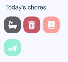
The result of the test with a 6 year old gave us a hint that the icons in figure 1 were not as explanatory. From the overview screen they do not say much about what they mean. Pressing the buttons reveals details with a text describing what to do. The 13-year old seemed to understand the logic behind the icons as symbols but requested that maybe the icons to be texted underneath.

The insight gained from the two users seemed to be that they understand what the icons represent but don’t know what kind of chore and the details surrounding the chore would be. A solution to this insight would be the accompany the icon with text underneath it or maybe make the icon bigger and add the text on the icon. Since every icon is coupled with one static task we find it that we have to have more data before making tweaks on it. The cognitive load in remembering what 4 icons are meaning doesn’t seem that high and both users did understand what the meaning was when they pressed the icon and read the instruction. Unfortunately further user testing was not made. A further visual design polish was made to final visual design.
After we presented the project critic was received on the very limited user testing, the limited engagement with others in the early stages of the project. An example of engagement with others would be to ask parents before starting the digital prototype if the proposed design makes sense and if it presents any usefulness. I totally agree with the feedback given to us. There was to little engagement with others and so the final product is based on what we as a group think is useful. Verifying our design with other users would make our work more credible and robust for real-world usage. Arguing for the design choices we made were with other words useless other than from a technical stand point. Although iterations were made on the prototype, it was not made with the backing support of users thoughts and recommendations. It was purely a technical design iteration phase done by us in the group.
As a designer the last thing to do is to be isolated in the process and design from a very limited perspective. It is a huge drawback as the very core in designing is to create for others, solve problems and meet their criteria and needs. Needless to say the project could have been executed far better…